American Kirby Is Hardcore: Difference between revisions
No edit summary |
No edit summary |
||
| (10 intermediate revisions by 4 users not shown) | |||
| Line 11: | Line 11: | ||
{{examples}} |
{{examples}} |
||
== |
== [[Anime]] and [[Manga]] == |
||
| ⚫ | * Astro Boy is known to be very cute and innocent. But when the 2003 anime was brought to America, most of the advertisement focused on the action scenes and his super hero side. The dubbing gave him a harsher and more snarky attitude as well. It also cut out most of Astro's cute child-like moments. To say nothing of the DVD boxset cover which is just his face looking absurdly angry. |
||
| ⚫ | * Even when it became [[Darker and Edgier]], the ''[[Dragon Ball]]'' franchise has always had a humorous, whimsical tone, summed up nicely by DBZ's [[Crazy Awesome]] Japanese theme tune, "[http://www.youtube.com/watch?v=NtFMwF7CKGo&feature=related Cha-La Head Cha-La]". Its North American opening themes, on the other hand, have ranged from "[http://www.youtube.com/watch?v=WAshPnOKzSg Rock The Dragon]" to… [http://www.youtube.com/watch?v=O27PUI1veBg well, this]. Later English-language releases have either kept or translated the Japanese themes. |
||
| ⚫ | ** When CNX ([[Cartoon Network]] UK's short-lived attempt at attracting the 15-35 male demographic) got the rights to show the original ''[[Dragon Ball]]'', the [[The Ocean Group|Canadian-dubbed]] episodes they acquired featured [http://www.youtube.com/watch?v=mVrVTinOsBw a cheerful kid-focused opening theme]. Fearing ridicule from their target audience, a new opening with more action-packed scenes from the show was thrown together, complete with [[Kung Foley]] and [http://www.youtube.com/watch?v=sBkVLTHy_2c a remixed theme]. (Though the Canadian themes were accidentally shown on occasion.) |
||
| ⚫ | |||
| ⚫ | |||
| ⚫ | * Nelvana's infamous [[Macekre]] English dub of ''[[Cardcaptor Sakura]]'', while not exactly "hardcore," considerably downplayed the [[Shojo]] cuteness of the original, essentially trying to change it into [[Shonen]] (even changing the show's name to just ''Cardcaptors'', presumably to downplay the fact that the main character is a girl, and cutting out the first seven episodes, which take place before Sakura's male rival Syaoran is introduced). The original opening theme was replaced with a more histrionic rock song, Sakura and her friends sounded more like teenagers than elementary schoolers, and perhaps most egregiously of all, Kero was given a [[Totally Radical]] dudebro voice and his characterization was changed to be more like a comedic foil sidekick akin to Mushu from ''[[Mulan]]''. As a result, the English dub had a completely different feel from the Japanese original, and anyone who's seen the latter would be able to spot the dub's attempts to turn the show into something quite different from what it was originally. |
||
| ⚫ | * The same thing was done for ''[[Vision of Escaflowne]]'' to make it more hardcore they removed THE ENTIRE FIRST EPISODE because it focused too much on romance leaving many American fans confused as to what was happening. The show was eventually cancelled while the Canadian dub which kept the first episode finished its entire run. |
||
| ⚫ | * Some of the dub voices in ''[[Axis Powers Hetalia]]''. Most notably is Russia, who had a higher-pitched, cuter, somewhat happier voice in the [http://www.youtube.com/watch?v=a5uWmMImOf0 Japanese] version, and a deeper, gruffer voice in the [http://www.youtube.com/watch?v=EoeCZf9zc1A&feature=relmfu English dub]. It's left up to the watchers to determine whether this was done to better fit the [[Husky Russkie|stereotype]] or to defuse some of the [[Cute and Psycho|horror]]. |
||
| ⚫ | * ''[[Madoka Magica]]'' was released as 6 two-episode boxsets in Japan, with [http://wiki.puella-magi.net/Madoka_Magica_Products#Blu-Ray_Discs different boxarts for each.] Three of the boxarts show characters looking happy and/or cute, two are relatively neutral, and one has a very dark and angsty mood to it. The U.S. release was 3 four-episode boxsets, and used three of the existing boxart pictures. [[Foregone Conclusion|To the surprise of no one]], they chose the two neutral ones (the first and last) and the angsty one (number four). {{spoiler|This may be somewhat justified given the nature of the series, but still...}} |
||
== [[Comic Books]] == |
|||
| ⚫ | |||
| ⚫ | * This is more a case of Modern [[DC Comics]] Is Hardcore, but check out [https://web.archive.org/web/20190614052653/https://www.dccomics.com/ the cover] of a recent trade paperback they put out. Now [http://dc.wikia.com/wiki/Superboy_Vol_1_76 take] [http://dc.wikia.com/wiki/Superman_Vol_1_138 a] [https://web.archive.org/web/20120922132410/http://dc.wikia.com/wiki/Flash_Vol_1_127 look] [http://dc.wikia.com/wiki/Detective_Comics_Vol_1_339 at] [http://dc.wikia.com/wiki/Hawkman_Vol_1_16 some] [http://dc.wikia.com/wiki/Wonder_Woman_Vol_1_170 of] [http://dc.wikia.com/wiki/Strange_Adventures_Vol_1_201 the] [https://web.archive.org/web/20150623184606/http://dc.wikia.com/wiki/Shazam_Vol_1_9 original] [http://dc.wikia.com/wiki/Detective_Comics_Vol_1_482 covers...] |
||
| ⚫ | |||
| ⚫ | * The ''[[Redwall]]'' series has produced a lot of covers over the years, ranging from cartoonish to realistic, from gritty and abstract to epic and clear-drawn. Although every country's publications had their own different variations of all ends of the scale, there are some pretty standard levels for their home country (which may not least be due to the artists themselves): |
||
| ⚫ | |||
| ⚫ | ** American Covers are similarly colourful but almost constantly more epical playing this trope completely straight ([http://images2.wikia.nocookie.net/__cb20090107071359/redwall/images/d/d4/MTWHardcover.jpg here] and [http://images1.wikia.nocookie.net/__cb20060211193954/redwall/images/d/d1/PearlsOfLutraFirebird.jpg here]). But their chapter illustrations are either rather cartoonish and abstract ([http://images3.wikia.nocookie.net/__cb20051015005927/redwall/images/c/c7/Mattimeo.jpg here]) or beautifully copper/plated ([http://images2.wikia.nocookie.net/__cb20080229101223/redwall/images/1/11/Samkim2.PNG here]). |
||
| ⚫ | ** French covers are sometimes kept in pseudo-3d-rendering, both gritty and abstract (perhaps even downright disturbing). Just look at those rotoscopes of humans with animals' heads ([http://redwall.wikia.com/wiki/File:Mf-france-vol1.jpg here] and [http://images2.wikia.nocookie.net/__cb20081013043918/redwall/images/e/ea/FrenchSalamandastronVol4.gif here]). |
||
| ⚫ | |||
| ⚫ | |||
| ⚫ | ** German covers stay usually on one level with the British ones ([http://images3.wikia.nocookie.net/__cb20060105082731/redwall/images/4/4f/Matti-german.jpg like here]), but have quite some... unnerving exceptions ([http://images4.wikia.nocookie.net/__cb20060106055125/redwall/images/f/f9/GermanMossflower2.jpg here] and [http://images4.wikia.nocookie.net/__cb20080422054506/redwall/images/3/37/Redwallaudio1995.jpg here]). [[Uncanny Valley]] ahead. |
||
| ⚫ | * More like "Russian ''[[Warrior Cats|Warriors]]'' is Hardcore". Compare [https://web.archive.org/web/20110408185917/http://www.warriorswish.net/gallery/displayimage.php?pid=2&fullsize=1 this] to [https://web.archive.org/web/20110408185934/http://www.warriorswish.net/gallery/displayimage.php?pid=35&fullsize=1 this]. There's a lot more where that came from: The title translation is also subject to this having been translated as ''Raging Storm'' rather then ''Rising Storm''. Also, the French title for ''Fire and Ice'' roughly means ''In Fire and In Blood''. |
||
| ⚫ | |||
| ⚫ | |||
| ⚫ | * The [[Tortall Universe|Protector of the Small]] quartet has [https://web.archive.org/web/20130508121416/http://tamorapierce.wikia.com/wiki/The_Protector_of_the_Small_covers different covers] in the US and the UK. American [http://images1.wikia.nocookie.net/__cb20080615175435/tamorapierce/images/thumb/7/79/Squire.jpg/102px-Squire.jpg Squire] has Keladry of Mindelan holding a baby griffin and looking at the viewer with a faint smile; [http://images3.wikia.nocookie.net/__cb20100109210651/tamorapierce/images/thumb/2/22/Squire_uk_paperback.jpg/123px-Squire_uk_paperback.jpg in the UK] she's looking at it and smiling more broadly. US [http://tamorapierce.wikia.com/wiki/File:Lady_Knight.jpg Lady Knight] has her staring at us with a hostile expression; in the UK she [http://tamorapierce.wikia.com/wiki/File:Ladyknightuk.jpg looks to the side] and seems more hopeful. Notably, although three books out of the trilogy have different artwork, they all feature the same subject, just interpreted differently. |
||
| ⚫ | * Peter Grant is way macho in the [http://2.bp.blogspot.com/_f50VvY-dR9k/TTFXfCPOleI/AAAAAAAAAU0/8SuxsbjJmo0/s1600/9780345524256.jpg US cover] of [[Midnight Riot]]/[[Rivers of London]] compared to the restrained 'arty' look of the [http://1.bp.blogspot.com/_f50VvY-dR9k/TSl06w6CaTI/AAAAAAAAAUc/7STCe6nzULE/s1600/riverscover_.jpg British cover]. Also note that Peter Grant, who in the books is described as a slender mixed race young man who by his own admission looks more North African, has metamorphosed into a [[Scary Black Man]]. And as a [[British Coppers|British Copper]], he'd better have signed for that gun. |
||
| ⚫ | |||
| ⚫ | |||
| ⚫ | |||
== [[Video Games]] == |
|||
=== Action-Adventure Games === |
=== Action-Adventure Games === |
||
* Compare the [https://web.archive.org/web/20121102144059/http://image.com.com/gamespot/images/bigboxshots/4/563284_2715_front.jpg Japanese] and [http://www.gameexpress.com/images/product/original/039854000225F.JPG American] box art for the obscure Game Boy port of ''Milon's Secret Castle''. |
* Compare the [https://web.archive.org/web/20121102144059/http://image.com.com/gamespot/images/bigboxshots/4/563284_2715_front.jpg Japanese] and [http://www.gameexpress.com/images/product/original/039854000225F.JPG American] box art for the obscure Game Boy port of ''Milon's Secret Castle''. |
||
| Line 19: | Line 52: | ||
** Not surprisingly, ''Magic John''/''Totally Rad'' was published by Jaleco, a company famous for having its game's characters and plot being almost completely altered for American release. A good example being ''Sayuuki World 2'', a game based loosely on ''The Journey to the West'' which became the Native-American themed ''Whomp 'Em''. The original ''Sayuuki World'' was never released outside Japan. |
** Not surprisingly, ''Magic John''/''Totally Rad'' was published by Jaleco, a company famous for having its game's characters and plot being almost completely altered for American release. A good example being ''Sayuuki World 2'', a game based loosely on ''The Journey to the West'' which became the Native-American themed ''Whomp 'Em''. The original ''Sayuuki World'' was never released outside Japan. |
||
** ''Taro's Quest'', an unreleased and unfinished localization of Jaleco's ''[[Dragon Quest]]'' clone ''Jajamaru Ninpou Chou'', had major changes to the graphics, redrawing the character portraits to be less [[Super-Deformed]] and outright replacing some of the more goofy-looking monsters. |
** ''Taro's Quest'', an unreleased and unfinished localization of Jaleco's ''[[Dragon Quest]]'' clone ''Jajamaru Ninpou Chou'', had major changes to the graphics, redrawing the character portraits to be less [[Super-Deformed]] and outright replacing some of the more goofy-looking monsters. |
||
* The first Super Famicom ''[[Ganbare Goemon]]'' game was translated and brought over as ''Legend of the Mystical Ninja'', and [[Macekre|funky character renaming aside]] (Kid Ying and Dr. Yang? ''REALLY?''), the [http://www.hardcoregaming101.net/goemon/goemon1sfc.jpg box art] was suitably [http://www.hardcoregaming101.net/goemon/mysticalninjasnesa.jpg "Americanised"]. |
* The first Super Famicom ''[[Ganbare Goemon]]'' game was translated and brought over as ''Legend of the Mystical Ninja'', and [[Macekre|funky character renaming aside]] (Kid Ying and Dr. Yang? ''REALLY?''), the [https://web.archive.org/web/20131125205739/http://www.hardcoregaming101.net/goemon/goemon1sfc.jpg box art] was suitably [https://web.archive.org/web/20131125205739/http://www.hardcoregaming101.net/goemon/mysticalninjasnesa.jpg "Americanised"]. |
||
* ''[[EVO Search for Eden|E.V.O. Search for Eden]]'' is a [[Subversion]]; compare the [https://web.archive.org/web/20150330071406/http://ocremix.org/files/images/games/snes/5/e-v-o-search-for-eden-snes-cover-front-76900.jpg SNES version's] realistic, if fanciful, box art to the [[Kawaiiko|considerably cutesier]] [http://www.videogameden.com/sfc/cover/evo.jpg Super Famicom version]. Looks like a straight example, right? It turns out that the SNES version is actually using the ''original'' cover art from ''[http://medium.media.vgm.io/albums/59/1495/1495-1262596848.png 4.6 Billion Year Story: The Theory of Evolution]'',<ref>Which is what the SFC version of E.V.O. is named in Japan. Image is the cover art for the [http://vgmdb.net/album/1495 Symphonic Synth Suite album].</ref> made by the same company for the [[PC 98|PC-9801]], and of which ''E.V.O.'' is a (loose) port! |
* ''[[EVO Search for Eden|E.V.O. Search for Eden]]'' is a [[Subversion]]; compare the [https://web.archive.org/web/20150330071406/http://ocremix.org/files/images/games/snes/5/e-v-o-search-for-eden-snes-cover-front-76900.jpg SNES version's] realistic, if fanciful, box art to the [[Kawaiiko|considerably cutesier]] [http://www.videogameden.com/sfc/cover/evo.jpg Super Famicom version]. Looks like a straight example, right? It turns out that the SNES version is actually using the ''original'' cover art from ''[http://medium.media.vgm.io/albums/59/1495/1495-1262596848.png 4.6 Billion Year Story: The Theory of Evolution]'',<ref>Which is what the SFC version of E.V.O. is named in Japan. Image is the cover art for the [http://vgmdb.net/album/1495 Symphonic Synth Suite album].</ref> made by the same company for the [[PC 98|PC-9801]], and of which ''E.V.O.'' is a (loose) port! |
||
* Just when you thought Nintendo was eschewing this with Kirby, along comes ''[[The Legend of Zelda: Spirit Tracks]]''. In Japan and Europe, the box to Link's latest DS adventure features him happy riding his train (the train being the game's big innovation, after all) while in America, he's doing his best to look like a sword-brandishing tough guy. [http://pressthebuttons.typepad.com/.a/6a00d83452033569e20120a62ab5b1970b-pi Which kind of clashes with the art style.] |
* Just when you thought Nintendo was eschewing this with Kirby, along comes ''[[The Legend of Zelda: Spirit Tracks]]''. In Japan and Europe, the box to Link's latest DS adventure features him happy riding his train (the train being the game's big innovation, after all) while in America, he's doing his best to look like a sword-brandishing tough guy. [http://pressthebuttons.typepad.com/.a/6a00d83452033569e20120a62ab5b1970b-pi Which kind of clashes with the art style.] |
||
| Line 35: | Line 68: | ||
** In the Japanese version of the game the titular character is voiced by a woman with a much higher pitched, child-like voice compared to the [[Totally Radical]] teenage one he had in the American version, complete with cutesy little noises nearly every time he jumps. |
** In the Japanese version of the game the titular character is voiced by a woman with a much higher pitched, child-like voice compared to the [[Totally Radical]] teenage one he had in the American version, complete with cutesy little noises nearly every time he jumps. |
||
* ''[[Asterix]] and Obelix XXL'' is a bit "American Kirby" compared to the source material, with the titular characters more aggressive than usual (with a good reason though, since the premise is the burning of their village and the capture of all their friends); however, while the [http://www.hardcoregaming101.net/asterix/asterix_files/asterix-xxl-gc-cover-a.jpg European cover] shows their faces drawn similarly to the comic book, the [http://www.hardcoregaming101.net/asterix/asterix_files/asterix-xxl-ps2-cover-a.jpg American cover] is a render of their in-game selves, ready to fight. And, as you can notice, the game is called ''Asterix and Obelix '''Kick Buttix''''' in the US! |
* ''[[Asterix]] and Obelix XXL'' is a bit "American Kirby" compared to the source material, with the titular characters more aggressive than usual (with a good reason though, since the premise is the burning of their village and the capture of all their friends); however, while the [http://www.hardcoregaming101.net/asterix/asterix_files/asterix-xxl-gc-cover-a.jpg European cover] shows their faces drawn similarly to the comic book, the [http://www.hardcoregaming101.net/asterix/asterix_files/asterix-xxl-ps2-cover-a.jpg American cover] is a render of their in-game selves, ready to fight. And, as you can notice, the game is called ''Asterix and Obelix '''Kick Buttix''''' in the US! |
||
* ''[[Jak and Daxter]]'' got the reverse of this: Compare the [http://upload.wikimedia.org/wikipedia/en/b/b6/Jak_and_Daxter_-_The_Precursor_Legacy_Coverart.png original American cover] with the [http://www.hardcoregaming101.net/japanboxes/jak-jp.jpg Japanese port].<ref>Image from [http://www.hardcoregaming101.net/japanboxes/japanboxes2.htm Hardcore Gaming 101]</ref> Curiously, the American cover fits with the [[Darker and Edgier|tone of the rest of the series]], but not with the happy original. |
* ''[[Jak and Daxter]]'' got the reverse of this: Compare the [http://upload.wikimedia.org/wikipedia/en/b/b6/Jak_and_Daxter_-_The_Precursor_Legacy_Coverart.png original American cover] with the [https://web.archive.org/web/20150712102954/http://www.hardcoregaming101.net/japanboxes/jak-jp.jpg Japanese port].<ref>Image from [https://web.archive.org/web/20160208174730/http://www.hardcoregaming101.net/japanboxes/japanboxes2.htm Hardcore Gaming 101]</ref> Curiously, the American cover fits with the [[Darker and Edgier|tone of the rest of the series]], but not with the happy original. |
||
* The Japanese cover art for ''[[Dynasty Warriors|Dynasty Warriors 7]]'' was very minimalist, with simply the game's logo on a gold background. One can't blame Koei for wanting to spruce it up a bit. But they may have gone [https://web.archive.org/web/20121018163412/http://media2.shopto.net/boxart/PS3DY05.jpg a bit too far]. |
* The Japanese cover art for ''[[Dynasty Warriors|Dynasty Warriors 7]]'' was very minimalist, with simply the game's logo on a gold background. One can't blame Koei for wanting to spruce it up a bit. But they may have gone [https://web.archive.org/web/20121018163412/http://media2.shopto.net/boxart/PS3DY05.jpg a bit too far]. |
||
* ''[[Solatorobo]]'': While all covers are taken from official game art, the [http://1.bp.blogspot.com/-sruLyAW7i1Q/TaWuwcSk6HI/AAAAAAAAGvs/6AV9v5MsNYY/s1600/Solatorobo_red_the_hunter_cover.jpg Japanese cover] is definetly more happy-looking than the [http://images.nintendolife.com/games/ds/solatorobo_red_the_hunter/cover_large.jpg European] and [http://cdn02.animenewsnetwork.com/images/cms/the-x-button/42186/redcover.jpg American] ones. |
* ''[[Solatorobo]]'': While all covers are taken from official game art, the [http://1.bp.blogspot.com/-sruLyAW7i1Q/TaWuwcSk6HI/AAAAAAAAGvs/6AV9v5MsNYY/s1600/Solatorobo_red_the_hunter_cover.jpg Japanese cover] is definetly more happy-looking than the [http://images.nintendolife.com/games/ds/solatorobo_red_the_hunter/cover_large.jpg European] and [http://cdn02.animenewsnetwork.com/images/cms/the-x-button/42186/redcover.jpg American] ones. |
||
* Inverted in the ''[[PlayStation 2]]'' game called ''Dogs Life''. The PAL and American covers are [https://web.archive.org/web/20121102145924/http://image.com.com/gamespot/images/bigboxshots/2/917852_25707_front.jpg rather fitting for the game]; showcases the villains, protagonist, and the dogs you can control all in the style used for cutscenes. The Japanese cover is [https://web.archive.org/web/20121102145649/http://image.com.com/gamespot/images/bigboxshots/2/917852_63389_front.jpg just Jake running through a farm] that vaguely resembles the Clarksville levels; and a stylistic version of him anyway. |
* Inverted in the ''[[PlayStation 2]]'' game called ''Dogs Life''. The PAL and American covers are [https://web.archive.org/web/20121102145924/http://image.com.com/gamespot/images/bigboxshots/2/917852_25707_front.jpg rather fitting for the game]; showcases the villains, protagonist, and the dogs you can control all in the style used for cutscenes. The Japanese cover is [https://web.archive.org/web/20121102145649/http://image.com.com/gamespot/images/bigboxshots/2/917852_63389_front.jpg just Jake running through a farm] that vaguely resembles the Clarksville levels; and a stylistic version of him anyway. |
||
* In [http://www.youtube.com/watch?v=a7detDcmMKY the first English trailer] for ''[[Kid Icarus: Uprising]]'', Pit's voice gets even deeper than the English ''Brawl'' voice variant, mainly because his voice [[The Other Darrin|has changed]]. |
* In [http://www.youtube.com/watch?v=a7detDcmMKY the first English trailer] for ''[[Kid Icarus: Uprising]]'', Pit's voice gets even deeper than the English ''Brawl'' voice variant, mainly because his voice [[The Other Darrin|has changed]]. |
||
** Now that the box art is revealed, this trope is in play again. While both the [http://bzzz.3dsbuzz.com/wp-content/uploads/2012/01/tumblr_lxrdqeJKpZ1qzp9we.jpg Japanese]{{Dead link}} and [http://bzzz.3dsbuzz.com/wp-content/uploads/2012/01/tumblr_lxrdqeJKpZ1qzp9we2.jpg North American box]{{Dead link}} art show Pit with a furrowed brow, the NA version removed all traces of pink and gave him an angry frown instead of the open mouth smile. |
** Now that the box art is revealed, this trope is in play again. While both the [https://web.archive.org/web/20200909052852/http://bzzz.3dsbuzz.com/wp-content/uploads/2012/01/tumblr_lxrdqeJKpZ1qzp9we.jpg Japanese]{{Dead link}} and [https://web.archive.org/web/20200909052852/http://bzzz.3dsbuzz.com/wp-content/uploads/2012/01/tumblr_lxrdqeJKpZ1qzp9we2.jpg North American box]{{Dead link}} art show Pit with a furrowed brow, the NA version removed all traces of pink and gave him an angry frown instead of the open mouth smile. |
||
=== Action Games === |
=== Action Games === |
||
| Line 59: | Line 92: | ||
* ''[[River City Ransom]]'' is a textbook example. Contrast the [http://upload.wikimedia.org/wikipedia/en/0/0e/Downtown_Nekketsu_Monogatari_game_cover.jpg Japanese box art], in which everyone looks more or less [[Super-Deformed|like they do]] in the actual game, with the [http://upload.wikimedia.org/wikipedia/en/4/46/River_City_Ransom-front.jpg American box art]. Of course, even in the Japanese version, the heroes of that game, as well as every other game in the [[Kunio-Kun]] series, are indisputably hardcore. For the Japanese, "cute" and "hardcore" are [[Badass Adorable|not mutually exclusive]]. |
* ''[[River City Ransom]]'' is a textbook example. Contrast the [http://upload.wikimedia.org/wikipedia/en/0/0e/Downtown_Nekketsu_Monogatari_game_cover.jpg Japanese box art], in which everyone looks more or less [[Super-Deformed|like they do]] in the actual game, with the [http://upload.wikimedia.org/wikipedia/en/4/46/River_City_Ransom-front.jpg American box art]. Of course, even in the Japanese version, the heroes of that game, as well as every other game in the [[Kunio-Kun]] series, are indisputably hardcore. For the Japanese, "cute" and "hardcore" are [[Badass Adorable|not mutually exclusive]]. |
||
* The [https://web.archive.org/web/20121102145732/http://image.com.com/gamespot/images/bigboxshots/4/582034_86410_front.jpg American cover] of ''Robo Army'' is, ahem, more "hardcore" than the [https://web.archive.org/web/20121102145632/http://image.com.com/gamespot/images/bigboxshots/4/582034_2458_front.jpg Japanese original]. |
* The [https://web.archive.org/web/20121102145732/http://image.com.com/gamespot/images/bigboxshots/4/582034_86410_front.jpg American cover] of ''Robo Army'' is, ahem, more "hardcore" than the [https://web.archive.org/web/20121102145632/http://image.com.com/gamespot/images/bigboxshots/4/582034_2458_front.jpg Japanese original]. |
||
* ''[[Teenage Mutant Ninja Turtles Turtles in Time|Teenage Mutant Ninja Turtles IV: Turtles in Time]]''. [http://www.hardcoregaming101.net/tmntbeatemups/Turtles%20in%20Time%20SNES%20Japanese%20Box%20Art.jpg The Japanese version] had art that looked just like the [[Teenage Mutant Ninja Turtles 1987|'80s cartoon]] (and by proxy, the actual damn game). The American version? As per Konami of America's standards at the time, [http://www.hardcoregaming101.net/tmntbeatemups/Turtles%20in%20Time%20SNES%20American%20Box%20Art.jpg incredibly hardcore] and more like [[Teenage Mutant Ninja Turtles (comics)|the original comic]]. (See also: ''[[Sunset Riders]]'', most of the ''[[Contra]]'' games, and ''[[Castlevania]]'' ''III'' and ''IV''.) |
* ''[[Teenage Mutant Ninja Turtles Turtles in Time|Teenage Mutant Ninja Turtles IV: Turtles in Time]]''. [https://web.archive.org/web/20140102094015/http://www.hardcoregaming101.net/tmntbeatemups/Turtles%20in%20Time%20SNES%20Japanese%20Box%20Art.jpg The Japanese version] had art that looked just like the [[Teenage Mutant Ninja Turtles 1987|'80s cartoon]] (and by proxy, the actual damn game). The American version? As per Konami of America's standards at the time, [https://web.archive.org/web/20131126002115/http://www.hardcoregaming101.net/tmntbeatemups/Turtles%20in%20Time%20SNES%20American%20Box%20Art.jpg incredibly hardcore] and more like [[Teenage Mutant Ninja Turtles (comics)|the original comic]]. (See also: ''[[Sunset Riders]]'', most of the ''[[Contra]]'' games, and ''[[Castlevania]]'' ''III'' and ''IV''.) |
||
* The American cover art of ''[[Guardian Heroes]]'' replaced the original anime-style depictions of the six main characters with a fantasy novel-like illustration of Han fighting against the Undead Knight, [[Covers Always Lie|even though he was one of the heroes in the game]]. The European version used the original Japanese art, but replaced the two heroines, Serena and Nicole, with Zur the magician and Macho the bodybuilder, who aren't even main characters, turning the European cover into a complete sausage fest for no reason ([https://web.archive.org/web/20130514120436/http://www.kidfenris.com/guardheroescover.html see for yourself]). |
* The American cover art of ''[[Guardian Heroes]]'' replaced the original anime-style depictions of the six main characters with a fantasy novel-like illustration of Han fighting against the Undead Knight, [[Covers Always Lie|even though he was one of the heroes in the game]]. The European version used the original Japanese art, but replaced the two heroines, Serena and Nicole, with Zur the magician and Macho the bodybuilder, who aren't even main characters, turning the European cover into a complete sausage fest for no reason ([https://web.archive.org/web/20130514120436/http://www.kidfenris.com/guardheroescover.html see for yourself]). |
||
=== Fighting Games === |
=== Fighting Games === |
||
* Compared to [http://360.kombo.com/images/content/boxart/blazblue_360_box.jpg whatever North Americans got]{{Dead link}}, [http://www.gamesetwatch.com/100112-blazblue-2.jpg the boxart] of the European ''[[BlazBlue]]'' seems to suggest a Noel [[Third-Person Shooter]] spinoff rather than a [[Fighting Game]], among things. The fact that the iconic title is merely featured as a background element with more emphasis put on a title written in a generic font doesn't help. |
* Compared to [http://360.kombo.com/images/content/boxart/blazblue_360_box.jpg whatever North Americans got]{{Dead link}}, [https://web.archive.org/web/20130618024344/http://www.gamesetwatch.com/100112-blazblue-2.jpg the boxart] of the European ''[[BlazBlue]]'' seems to suggest a Noel [[Third-Person Shooter]] spinoff rather than a [[Fighting Game]], among things. The fact that the iconic title is merely featured as a background element with more emphasis put on a title written in a generic font doesn't help. |
||
* 2D fighting classic ''[[Guilty Gear]]'' had 2 different covers for all their installments which got ported over the Pacific, most notably the Isuka installment: The [http://www.gamefaqs.com/ps2/919961-guilty-gear-isuka/images/box-96904 Japanese version] was rather KINKY (as in NSFW) with what apparently is a threesome(!) where a visibly flushed A.B.A. is seemingly getting double-penetrated in a sandwich between Ky Kiske (behind) and Sol Badguy (front), who are meanwhile completely ignoring her as they are engaged in a staring contest with each other (homoerotically charged full of [[Foe Yay]]). The [http://www.gamefaqs.com/ps2/919961-guilty-gear-isuka/images/box-57948 American version] on the other hand, was a rather generic image of Sol wielding his Fireseal sword in the style of a bazooka with the hilt pointed at you. |
* 2D fighting classic ''[[Guilty Gear]]'' had 2 different covers for all their installments which got ported over the Pacific, most notably the Isuka installment: The [http://www.gamefaqs.com/ps2/919961-guilty-gear-isuka/images/box-96904 Japanese version] was rather KINKY (as in NSFW) with what apparently is a threesome(!) where a visibly flushed A.B.A. is seemingly getting double-penetrated in a sandwich between Ky Kiske (behind) and Sol Badguy (front), who are meanwhile completely ignoring her as they are engaged in a staring contest with each other (homoerotically charged full of [[Foe Yay]]). The [http://www.gamefaqs.com/ps2/919961-guilty-gear-isuka/images/box-57948 American version] on the other hand, was a rather generic image of Sol wielding his Fireseal sword in the style of a bazooka with the hilt pointed at you. |
||
* Pit's (from ''[[Kid Icarus]]'') English voice in ''[[Super Smash Bros Brawl]]'' sounds noticeably older |
* Pit's (from ''[[Kid Icarus]]'') English voice in ''[[Super Smash Bros Brawl]]'' sounds noticeably older than his original Japanese voice. [http://www.youtube.com/watch?v=DWYQx0SvVOI#t=2m36s Video comparison.] |
||
** As for the actual cover art for the game, Kirby's facial expression was left alone in the U.S. version (contrary to the name of the trope) -- the [http://www.ssbwiki.com/File:SSBB-cover-japan.jpg bright, partly cloudy blue skies] were [http://www.ssbwiki.com/File:SSBB_Cover.jpg removed], on the other hand. |
** As for the actual cover art for the game, Kirby's facial expression was left alone in the U.S. version (contrary to the name of the trope) -- the [http://www.ssbwiki.com/File:SSBB-cover-japan.jpg bright, partly cloudy blue skies] were [http://www.ssbwiki.com/File:SSBB_Cover.jpg removed], on the other hand. |
||
| Line 87: | Line 120: | ||
=== Platformers === |
=== Platformers === |
||
* The [[Trope Namer]] here is ''[[Kirby]]''. [http://www.n-sider.com/contentview.php?contentid=407 The box art for many of his games] have had angry eyebrows added to the main character to make an 8-inch-high pink puffball seem more aggressive. This strange practice is joked on originally in [http://angryamericankirby.ytmnd.com/ this] [[YTMND]] and subsequently in [http://www.brawlinthefamily.com/?p=288 this] ''[[Brawl in the Family]]'' strip. It seems to have calmed for the time being with the release of ''[[Super Smash Bros.]]. Brawl'', ''[[Kirby Super Star]] Ultra'', and more recently, ''[[Kirby's |
* The [[Trope Namer]] here is ''[[Kirby]]''. [http://www.n-sider.com/contentview.php?contentid=407 The box art for many of his games] have had angry eyebrows added to the main character to make an 8-inch-high pink puffball seem more aggressive. This strange practice is joked on originally in [http://angryamericankirby.ytmnd.com/ this] [[YTMND]] and subsequently in [http://www.brawlinthefamily.com/?p=288 this] ''[[Brawl in the Family]]'' strip. It seems to have calmed for the time being with the release of ''[[Super Smash Bros.]]. Brawl'', ''[[Kirby Super Star]] Ultra'', and more recently,{{when}} ''[[Kirby's Epic Yarn]]'', whose boxarts have Kirby actually looking happy for a change, but it seems to be creeping up again no thanks to ''[[Kirby Mass Attack]]''{{'}}s cover (though to be fair, roughly half the Kirbys on ''Mass Attack''{{'}}s cover still retain their cute/curious expressions and most the the "hardcore" one are already attacking something). It's back in full force with ''[[Kirby's Return to Dream Land]]''. |
||
** This practice is [[Older Than They Think]], too, as a ''Kirby's Dream Land 2'' commercial aired in the US turned Kirby, Rick, Kine, and Coo into [http://www.youtube.com/watch?v=EqVVG4FCq7w scowling tough guys (or, you know, as tough as an 8-inch high puffball and his similarly-sized friends can be) roughhousing some Hell's Angels]. As well, compare the commercials for ''[http://www.youtube.com/watch?v=gU6cHCkWqy8 Kirby's Dreamland]'' and ''[http://www.youtube.com/watch?v=jL1okxuvGRQ Kirby's Adventure]'', to say nothing of [https://web.archive.org/web/20121021041938/http://www.1up.com/do/feature?pager.offset=3&cId=3152506 the magazine ad for Kirby's Avalanche and Kirby's Dream Course] (scroll down the page). "He used to be such a good boy." |
** This practice is [[Older Than They Think]], too, as a ''Kirby's Dream Land 2'' commercial aired in the US turned Kirby, Rick, Kine, and Coo into [http://www.youtube.com/watch?v=EqVVG4FCq7w scowling tough guys (or, you know, as tough as an 8-inch high puffball and his similarly-sized friends can be) roughhousing some Hell's Angels]. As well, compare the commercials for ''[http://www.youtube.com/watch?v=gU6cHCkWqy8 Kirby's Dreamland]'' and ''[http://www.youtube.com/watch?v=jL1okxuvGRQ Kirby's Adventure]'', to say nothing of [https://web.archive.org/web/20121021041938/http://www.1up.com/do/feature?pager.offset=3&cId=3152506 the magazine ad for Kirby's Avalanche and Kirby's Dream Course] (scroll down the page). "He used to be such a good boy." |
||
*** Even older than ''that'', albeit to a lesser extent. Contrast the [http://images.wikia.com/kirby/en/images/0/0d/603710.jpg American box art]{{Dead link}} for the original ''Kirby's Dream Land'' to the [http://images2.wikia.nocookie.net/__cb20100506155654/kirby/en/images/c/c9/KDLboxartjapan.png Japanese box art]{{Dead link}}. Yes, Kirby's still plenty happy in America...but he's ''white'', because it was thought that a soft, [[Pink Is for Sissies|pink character]] wouldn't appeal to American audiences. |
*** Even older than ''that'', albeit to a lesser extent. Contrast the [http://images.wikia.com/kirby/en/images/0/0d/603710.jpg American box art]{{Dead link}} for the original ''Kirby's Dream Land'' to the [http://images2.wikia.nocookie.net/__cb20100506155654/kirby/en/images/c/c9/KDLboxartjapan.png Japanese box art]{{Dead link}}. Yes, Kirby's still plenty happy in America...but he's ''white'', because it was thought that a soft, [[Pink Is for Sissies|pink character]] wouldn't appeal to American audiences. |
||
| Line 95: | Line 128: | ||
** On the ([[Fan Work|unofficial]]) extreme end of the scale, there is ''[[There Will Be Brawl]]'''s version of Kirby... |
** On the ([[Fan Work|unofficial]]) extreme end of the scale, there is ''[[There Will Be Brawl]]'''s version of Kirby... |
||
** ''[[Nintendo Power]]'' lampshaded this phenomenon in the May 2011 issue's highlight on Kirby, saying he puts on his "angry eyes" for the boxart. |
** ''[[Nintendo Power]]'' lampshaded this phenomenon in the May 2011 issue's highlight on Kirby, saying he puts on his "angry eyes" for the boxart. |
||
*** As did IGN, when they launched a new feature comparing different box arts [http://ds.ign.com/articles/119/1192766p1.html Kirby went first] specifically thanks to the series' use of the trope. |
*** As did IGN, when they launched a new feature comparing different box arts [https://web.archive.org/web/20120516143506/http://ds.ign.com/articles/119/1192766p1.html Kirby went first] specifically thanks to the series' use of the trope. |
||
** Even the ''title'' of 2011's DS game seems to carry on in this tradition; known as ''Gather! Kirby'' in Japan, its English title is ''Kirby Mass Attack''. And to top it off, on the American boxart, nearly half of the Kirbies have angry faces... ''but the other half doesn't.'' This makes it... jarring, to say the least. |
** Even the ''title'' of 2011's DS game seems to carry on in this tradition; known as ''Gather! Kirby'' in Japan, its English title is ''Kirby Mass Attack''. And to top it off, on the American boxart, nearly half of the Kirbies have angry faces... ''but the other half doesn't.'' This makes it... jarring, to say the least. |
||
** ...and then ''[[Kirby's Return to Dream Land]]'' swings the pendulum right back around and [https://web.archive.org/web/20120118012659/http://wii.ign.com/articles/119/1193309p1.html gives him angry eyes again]. Contrast [http://www.famitsu.com/news/201109/images/00050121/oW46AxTddQaobbc9KREq9bx19p147sQO.jpg the Japanese boxart]. |
** ...and then ''[[Kirby's Return to Dream Land]]'' swings the pendulum right back around and [https://web.archive.org/web/20120118012659/http://wii.ign.com/articles/119/1193309p1.html gives him angry eyes again]. Contrast [http://www.famitsu.com/news/201109/images/00050121/oW46AxTddQaobbc9KREq9bx19p147sQO.jpg the Japanese boxart]. |
||
| Line 121: | Line 154: | ||
** In ''[[Mega Man ZX]] Advent'', this cover is actually poked fun at in the American version. In the game, for a mission you are supposed to get a data disk, an in game item that can be looked at to see a picture and some information, for a kid who wants something with a hero on it. In the end of "talk to the people who SHOULD have one" you find out that the kid has the only data disk with anything close, the data disk with the American boxart of the original ''Mega Man''. The kid openly calls it weird, and not very heroic at all. You then get it to view at any time. |
** In ''[[Mega Man ZX]] Advent'', this cover is actually poked fun at in the American version. In the game, for a mission you are supposed to get a data disk, an in game item that can be looked at to see a picture and some information, for a kid who wants something with a hero on it. In the end of "talk to the people who SHOULD have one" you find out that the kid has the only data disk with anything close, the data disk with the American boxart of the original ''Mega Man''. The kid openly calls it weird, and not very heroic at all. You then get it to view at any time. |
||
** Terrible Boxart Mega Man is so (in)famous that this is the version Capcom chooses to cameo in [[Capcom Versus Whatever|Street Fighter Versus Tekken]]. |
** Terrible Boxart Mega Man is so (in)famous that this is the version Capcom chooses to cameo in [[Capcom Versus Whatever|Street Fighter Versus Tekken]]. |
||
* An old [[NES]] game, ''Power Blade'' (originally ''Power Blazer'' in Japan) is an interesting early example. Read the article about it [http://www.hardcoregaming101.net/powerblade/powerblade.htm here.] |
* An old [[NES]] game, ''Power Blade'' (originally ''Power Blazer'' in Japan) is an interesting early example. Read the article about it [https://web.archive.org/web/20131125152928/http://www.hardcoregaming101.net/powerblade/powerblade.htm here.] |
||
* ''[[Alisia Dragoon]]'', a fairly obscure Genesis game by [[Game Arts]], features a [http://www.gamefaqs.com/console/genesis/image/586021.html?box=3311 pretty cover] in Japan, while the [http://www.gamefaqs.com/console/genesis/image/586021.html?box=88170 Western boxart] is... well, cool-looking but [[Contemptible Cover|rather contemptible]]. |
* ''[[Alisia Dragoon]]'', a fairly obscure Genesis game by [[Game Arts]], features a [http://www.gamefaqs.com/console/genesis/image/586021.html?box=3311 pretty cover] in Japan, while the [http://www.gamefaqs.com/console/genesis/image/586021.html?box=88170 Western boxart] is... well, cool-looking but [[Contemptible Cover|rather contemptible]]. |
||
* The original boxart for ''[[Sonic the Hedgehog]]'' gave us a fairly confident looking Sonic with a tasty palette of colors surrounding him. The US boxart gave him a chubbier redesign with a mohawk, the art has him posing for a 'tude expression, and they sprayed him with a coat of airbrush. Even the original members of Sonic Team said they [[Creator Backlash|despised this Americanized Sonic design.]] |
* The original boxart for ''[[Sonic the Hedgehog]]'' gave us a fairly confident looking Sonic with a tasty palette of colors surrounding him. The US boxart gave him a chubbier redesign with a mohawk, the art has him posing for a 'tude expression, and they sprayed him with a coat of airbrush. Even the original members of Sonic Team said they [[Creator Backlash|despised this Americanized Sonic design.]] |
||
| Line 146: | Line 179: | ||
* Not even ''[[Disney]]'' games were immune to this. The Genesis/Megadrive title ''[[Quackshot]]'' features a dynamic shot of a scowling [[Donald Duck]] baring his gun with a evil looking Pete plotting in the background. The Japanese cover features Donald and his nephews smiling at you with Pete throwing a comical tantrum behind them. Granted [[Grumpy Bear|Donald]] [[Hair-Trigger Temper|being Donald]] the Western cover might be considered more in-character. |
* Not even ''[[Disney]]'' games were immune to this. The Genesis/Megadrive title ''[[Quackshot]]'' features a dynamic shot of a scowling [[Donald Duck]] baring his gun with a evil looking Pete plotting in the background. The Japanese cover features Donald and his nephews smiling at you with Pete throwing a comical tantrum behind them. Granted [[Grumpy Bear|Donald]] [[Hair-Trigger Temper|being Donald]] the Western cover might be considered more in-character. |
||
* In some of the ''[[Bonk]]'' games, Bonk's second powerup form was changed. In the japanese verison he showed his love of [[Trademark Favorite Food|meat]] by turning into a doe-eyed version of himself who attacked with hearts. In the US version he was changed into a scowling form with a scar rather similar to the page image. Though his third form was hardcore in both versions. |
* In some of the ''[[Bonk]]'' games, Bonk's second powerup form was changed. In the japanese verison he showed his love of [[Trademark Favorite Food|meat]] by turning into a doe-eyed version of himself who attacked with hearts. In the US version he was changed into a scowling form with a scar rather similar to the page image. Though his third form was hardcore in both versions. |
||
* Data East USA gave the [[Irem]] game ''Kaiketsu Yanchamaru'' a [[Totally Radical]] makeover, turning it into ''Kid Niki: Radical Ninja''. Kid Niki was given spiky hair in-game, and the NES version got [http://www.hardcoregaming101.net/kidniki/kidniki.jpg a totally hardcore cover] (by contrast, the [http://www.retrogame-shop.com/shop/images/kaiketsu.jpg Famicom] cover is downright cartoonish). |
* Data East USA gave the [[Irem]] game ''Kaiketsu Yanchamaru'' a [[Totally Radical]] makeover, turning it into ''Kid Niki: Radical Ninja''. Kid Niki was given spiky hair in-game, and the NES version got [https://web.archive.org/web/20131125174943/http://www.hardcoregaming101.net/kidniki/kidniki.jpg a totally hardcore cover] (by contrast, the [http://www.retrogame-shop.com/shop/images/kaiketsu.jpg Famicom] cover is downright cartoonish). |
||
* An example that seemingly has nothing to do with America: Namco's ''Legend of Valkyrie'' series is rarely seen outside of Japan, but one of the side games, ''Sandra's Great Adventure'', was released in Europe under the name ''Whirlo''. As part of the localization, the main character's in-game sprite was changed to give him angry eyes. |
* An example that seemingly has nothing to do with America: Namco's ''Legend of Valkyrie'' series is rarely seen outside of Japan, but one of the side games, ''Sandra's Great Adventure'', was released in Europe under the name ''Whirlo''. As part of the localization, the main character's in-game sprite was changed to give him angry eyes. |
||
| Line 160: | Line 193: | ||
=== Roguelike === |
=== Roguelike === |
||
* The [[Nintendo DS]] version of ''[[Shiren the Wanderer]]''. The original Japanese cover art (by former Capcom illustrator Akiman) is [https://web.archive.org/web/20121102145741/http://image.com.com/gamespot/images/bigboxshots/3/925583_61404_front.jpg very nice], the Western one, [https://web.archive.org/web/20121102145928/http://image.com.com/gamespot/images/bigboxshots/3/925583_94826_front.jpg well...]. Shiren looks like he's going to slit your throat or something. And what they did to poor [[Weasel Mascot|Koppa]] and [[Cute Bruiser|Oryu]] is ''just wrong''. Bad, bad Sega! |
* The [[Nintendo DS]] version of ''[[Shiren the Wanderer]]''. The original Japanese cover art (by former Capcom illustrator Akiman) is [https://web.archive.org/web/20121102145741/http://image.com.com/gamespot/images/bigboxshots/3/925583_61404_front.jpg very nice], the Western one, [https://web.archive.org/web/20121102145928/http://image.com.com/gamespot/images/bigboxshots/3/925583_94826_front.jpg well...]. Shiren looks like he's going to slit your throat or something. And what they did to poor [[Weasel Mascot|Koppa]] and [[Cute Bruiser|Oryu]] is ''just wrong''. Bad, bad Sega! |
||
* Cult classic rpg/sim hybrid ''Azure Dreams'' for the PSX (which is basically ''[[Harvest Moon]]'' if the main character were a monster-tamer/treasure-hunter instead of a farmer/fisherman) had 2 different covers: The [http://www.hardcoregaming101.net/azuredreams/azuredreamsj.jpg Japanese version] was cute and emphasized the dating-sim/harem-romance aspects of the game (featuring all the girls - plus your kid sister and your sidekick - in the game you can eventually get via [[Tenchi Solution]]), while the [http://upload.wikimedia.org/wikipedia/en/7/78/Azure_Dreams_Coverart.png American version] was scenic and emphasized the treasure-hunting/dungeon-crawling aspects of the game (the hero gazing at his hometown from a mountain cliff). |
* Cult classic rpg/sim hybrid ''Azure Dreams'' for the PSX (which is basically ''[[Harvest Moon]]'' if the main character were a monster-tamer/treasure-hunter instead of a farmer/fisherman) had 2 different covers: The [https://web.archive.org/web/20131125171753/http://www.hardcoregaming101.net/azuredreams/azuredreamsj.jpg Japanese version] was cute and emphasized the dating-sim/harem-romance aspects of the game (featuring all the girls - plus your kid sister and your sidekick - in the game you can eventually get via [[Tenchi Solution]]), while the [http://upload.wikimedia.org/wikipedia/en/7/78/Azure_Dreams_Coverart.png American version] was scenic and emphasized the treasure-hunting/dungeon-crawling aspects of the game (the hero gazing at his hometown from a mountain cliff). |
||
** Still, we got the Japanese box art as the cover for the manual (at least in the European version anyway), so not all bad. |
** Still, we got the Japanese box art as the cover for the manual (at least in the European version anyway), so not all bad. |
||
=== Real-Time Strategy === |
=== Real-Time Strategy === |
||
* ''[[Pikmin]]'' has two covers. The Japanese image contains Pikmin just hanging out on a branch. The North-American and European cover image contains a battle. The same thing happened with the sequel, though Canada and Europe had a different, also peaceful cover. |
* ''[[Pikmin]]'' has two covers. The Japanese image contains Pikmin just hanging out on a branch. The North-American and European cover image contains a battle. The same thing happened with the sequel, though Canada and Europe had a different, also peaceful cover. |
||
* ''[[The Settlers]]'' European cover shows a cartoonish RTS city builder while the American Cover shows a rather stern looking lord in managing his kingdom/army [http://i20.photobucket.com/albums/b214/gyrobot/1267035563970.png Comparisons here]. Upon further inspection, the American cover of the settler usually just features the armor clad knight on the cover while the other shows the other professions being as prominent. The subsequent one features a slightly more colorful boxart [http://gamediv.com/Games/151/Main%20image.jpg seen here] |
* ''[[The Settlers]]'' European cover shows a cartoonish RTS city builder while the American Cover shows a rather stern looking lord in managing his kingdom/army [http://i20.photobucket.com/albums/b214/gyrobot/1267035563970.png Comparisons here]. Upon further inspection, the American cover of the settler usually just features the armor clad knight on the cover while the other shows the other professions being as prominent. The subsequent one features a slightly more colorful boxart [https://web.archive.org/web/20111230095246/http://gamediv.com/Games/151/Main%20image.jpg seen here] |
||
* The PSP version of ''[[Lemmings]]'' exhibits this trope. The [https://web.archive.org/web/20121102145835/http://image.com.com/gamespot/images/bigboxshots/5/928435_72609_front.jpg Japanese box art] depicts a bunch of happy Lemmings in a happy, bright environment. The [https://web.archive.org/web/20121102145623/http://image.com.com/gamespot/images/bigboxshots/5/928435_67503_front.jpg European box art] shows a crowd of Lemmings smiling at you. The [https://web.archive.org/web/20121102145717/http://image.com.com/gamespot/images/bigboxshots/5/928435_74076_front.jpg American box art] depicts a more active scene, and has a slightly duller color scheme compared to the other boxes. |
* The PSP version of ''[[Lemmings]]'' exhibits this trope. The [https://web.archive.org/web/20121102145835/http://image.com.com/gamespot/images/bigboxshots/5/928435_72609_front.jpg Japanese box art] depicts a bunch of happy Lemmings in a happy, bright environment. The [https://web.archive.org/web/20121102145623/http://image.com.com/gamespot/images/bigboxshots/5/928435_67503_front.jpg European box art] shows a crowd of Lemmings smiling at you. The [https://web.archive.org/web/20121102145717/http://image.com.com/gamespot/images/bigboxshots/5/928435_74076_front.jpg American box art] depicts a more active scene, and has a slightly duller color scheme compared to the other boxes. |
||
| Line 181: | Line 214: | ||
*** The art shift also renders one character, though ostensibly wearing the same outfit, considerably more [[Stripperiffic]]. |
*** The art shift also renders one character, though ostensibly wearing the same outfit, considerably more [[Stripperiffic]]. |
||
* While it's not a comparison between American and Japanese, looking at the boxart on the Xbox360 version of ''[[Eternal Sonata]]'' then looking at the [[Play Station 3]] version reveals that there were some drastic changes. The 360 version looks bright and innocent, with characters standing in a grassy meadow. The [[Play Station 3]] version has a darker background, and has the characters looking angry in various action poses. |
* While it's not a comparison between American and Japanese, looking at the boxart on the Xbox360 version of ''[[Eternal Sonata]]'' then looking at the [[Play Station 3]] version reveals that there were some drastic changes. The 360 version looks bright and innocent, with characters standing in a grassy meadow. The [[Play Station 3]] version has a darker background, and has the characters looking angry in various action poses. |
||
* ''[[Guardian's Crusade]]''. The [http://rpgfan.com/pics/guardians-crusade/box-japfront.jpg Japanese box art] is more colorful and rather whimsical in looks: showing Knight and Baby doing various activities you can do in the game, all the while looking dang adorable. The back cover is [http://rpgfan.com/pics/guardians-crusade/box-japback.jpg even more cuter]. The [http://upload.wikimedia.org/wikipedia/en/9/9e/Guardian%27sCrusadeCover.jpg American version] is more generic in comparison. The game came out about a year and a half after ''[[Final Fantasy VII]]'', during that dark period when American game companies thought that [[RPG]]s that weren't dark and existential wouldn't sell. |
* ''[[Guardian's Crusade]]''. The [https://web.archive.org/web/20191101192659/http://www.rpgfan.com/pics/guardians-crusade/box-japfront.jpg Japanese box art] is more colorful and rather whimsical in looks: showing Knight and Baby doing various activities you can do in the game, all the while looking dang adorable. The back cover is [https://web.archive.org/web/20051201184310/http://www.rpgfan.com/pics/guardians-crusade/box-japback.jpg even more cuter]. The [http://upload.wikimedia.org/wikipedia/en/9/9e/Guardian%27sCrusadeCover.jpg American version] is more generic in comparison. The game came out about a year and a half after ''[[Final Fantasy VII]]'', during that dark period when American game companies thought that [[RPG]]s that weren't dark and existential wouldn't sell. |
||
* When ''[[Pokémon]]'' was being localized for America, a significant portion of people at Nintendo thought that the characters were [[It Will Never Catch On|too cute to sell well]], and tried to get all of the Pokémon redone for the states as muscle-bound humanoid Pro-Wrestling monsters. In other words, they wanted to turn Pikachu into [[Kinnikuman]]. |
* When ''[[Pokémon]]'' was being localized for America, a significant portion of people at Nintendo thought that the characters were [[It Will Never Catch On|too cute to sell well]], and tried to get all of the Pokémon redone for the states as muscle-bound humanoid Pro-Wrestling monsters. In other words, they wanted to turn Pikachu into [[Kinnikuman]]. |
||
** Compare the box-art of the [http://archives.bulbagarden.net/media/upload/1/19/PokemonYellowJapanese.png Japanese version]{{Dead link}} of Pokémon Yellow to the [http://archives.bulbagarden.net/media/upload/2/2b/Pokemon_Yellow_boxart.jpg American version]{{Dead link}}. Remarkably similar to the depiction of Kirby from Japan to America. |
** Compare the box-art of the [http://archives.bulbagarden.net/media/upload/1/19/PokemonYellowJapanese.png Japanese version]{{Dead link}} of Pokémon Yellow to the [http://archives.bulbagarden.net/media/upload/2/2b/Pokemon_Yellow_boxart.jpg American version]{{Dead link}}. Remarkably similar to the depiction of Kirby from Japan to America. |
||
* ''[[The Last Remnant]]'''s Xbox 360 artwork depicted the young, typical ''[[Final Fantasy]]''-style androgynous male protagonist. The PC version, marketed to Western gamers, had a picture of an older, more badass antagonist, and a more energetic color scheme. |
* ''[[The Last Remnant]]'''s Xbox 360 artwork depicted the young, typical ''[[Final Fantasy]]''-style androgynous male protagonist. The PC version, marketed to Western gamers, had a picture of an older, more badass antagonist, and a more energetic color scheme. |
||
* ''[[Digital Devil Saga]]: Avatar Tuner'' arguably ''benefited'' from this phenomenon. The original box art for the two games depicted Serph/Varna and Sera/Varnani in static poses more reminiscent of action figures in a blister pack; the U.S. versions depict the exact same characters, but in more active poses. (Assuming, of course, you reverse the cover insert for the second game; the display box art depicts the entire cast in a battle scene, arguably embracing this trope in its entirety.) Though it's not like the game needed to be made any more hardcore, seeing as how it has plenty of demonic cannibalization anyway. |
* ''[[Digital Devil Saga]]: Avatar Tuner'' arguably ''benefited'' from this phenomenon. The original box art for the two games depicted Serph/Varna and Sera/Varnani in static poses more reminiscent of action figures in a blister pack; the U.S. versions depict the exact same characters, but in more active poses. (Assuming, of course, you reverse the cover insert for the second game; the display box art depicts the entire cast in a battle scene, arguably embracing this trope in its entirety.) Though it's not like the game needed to be made any more hardcore, seeing as how it has plenty of demonic cannibalization anyway. |
||
** While we're on the subject of [[Shin Megami Tensei]]'', just compare the original [http://www.hardcoregaming101.net/megaten/jackbrosj.jpg Japanese cover] of [[Lighter and Softer]] spinoff ''Jack Bros.'' with [http://www.hardcoregaming101.net/megaten/jackbros.jpg this... thing]. |
** While we're on the subject of ''[[Shin Megami Tensei]]'', just compare the original [http://www.hardcoregaming101.net/megaten/jackbrosj.jpg Japanese cover] of [[Lighter and Softer]] spinoff ''Jack Bros.'' with [http://www.hardcoregaming101.net/megaten/jackbros.jpg this... thing]. |
||
* Hardly uncommon in ''[[Tales (series)|Tales]]'' localizations: |
* Hardly uncommon in ''[[Tales (series)|Tales]]'' localizations: |
||
** ''[[Tales of Eternia]]'' (or ''[[Writing Around Trademarks|Tales of Destiny II]]'') originally had [http://www.gamefaqs.com/console/psx/image/526350.html?box=53165 a smiling group shot], which was replaced by [http://www.gamefaqs.com/console/psx/image/526350.html?box=40641 a scene of Farah and Reid ready to battle]. The absence of everyone else is... intriguing. |
** ''[[Tales of Eternia]]'' (or ''[[Writing Around Trademarks|Tales of Destiny II]]'') originally had [http://www.gamefaqs.com/console/psx/image/526350.html?box=53165 a smiling group shot], which was replaced by [http://www.gamefaqs.com/console/psx/image/526350.html?box=40641 a scene of Farah and Reid ready to battle]. The absence of everyone else is... intriguing. |
||
| Line 218: | Line 251: | ||
=== Simulation Games === |
=== Simulation Games === |
||
* There isn't much you can do to make peaceful series like ''[[Harvest Moon]]'' "hardcore" however many of the early western covers are more normal |
* There isn't much you can do to make peaceful series like ''[[Harvest Moon]]'' "hardcore" however many of the early western covers are more normal than the [[Tastes Like Diabetes]] Japanese ones. A noticeable exception is the European boxart for the first game: Compare the Japanese art, [https://web.archive.org/web/20121102145840/http://image.com.com/gamespot/images/bigboxshots/3/562623_4976_front.jpg with its cute animals and bright colors] to the [https://web.archive.org/web/20121102145948/http://image.com.com/gamespot/images/bigboxshots/3/562623_59784_front.jpg darker] and more realistic looking PAL cover. Notice how [[Covers Always Lie|Pete isn't wearing the right hat]] and the game [http://www.wired.com/images_blogs/photos/uncategorized/2008/02/11/harvestmoonsnes.jpg looks like this]. |
||
* The game ''[[Princess on Ice]]'' isn't so much "hardcore" as hideously ugly in the US version, even going so far as to replace the cute in-game sprites with "girls" that look like what you see on the box. [[media:princess-on-ice.jpg|Observe]]. |
* The game ''[[Princess on Ice]]'' isn't so much "hardcore" as hideously ugly in the US version, even going so far as to replace the cute in-game sprites with "girls" that look like what you see on the box. [[media:princess-on-ice.jpg|Observe]]. |
||
** Aksys learned their lesson afterward and released ''Rockin' Pretty'', which uses the same characters, [http://www.gamefaqs.com/portable/ds/image/954317.html with the artwork untouched.] |
** Aksys learned their lesson afterward and released ''Rockin' Pretty'', which uses the same characters, [http://www.gamefaqs.com/portable/ds/image/954317.html with the artwork untouched.] |
||
| Line 239: | Line 272: | ||
* Something akin to this trope occurred in ''[[Final Fantasy Tactics]]: The War of the Lions'', where Barrington's dialogue with Rafa on the Rooftop of Riovanes Castle was "punched up" to make it even ''more'' creepy and blatantly sexual. The original PSX version's translation instead ''very slightly'' [[Bowdlerization|downplayed that aspect.]] |
* Something akin to this trope occurred in ''[[Final Fantasy Tactics]]: The War of the Lions'', where Barrington's dialogue with Rafa on the Rooftop of Riovanes Castle was "punched up" to make it even ''more'' creepy and blatantly sexual. The original PSX version's translation instead ''very slightly'' [[Bowdlerization|downplayed that aspect.]] |
||
== |
== [[Web Original]] == |
||
| ⚫ | * Most paintings by the infamous Handre de Jager from ''[[Something Awful]]'' mercilessly parody this trope. The artist himself stated that his initial inspiration was the aforementioned original American boxart for ''[[Mega Man (video game)|Mega Man]]''. Handre's works can be found throughout the Internet. Be warned, they're disgusting and scary. |
||
=== Anime === |
|||
| ⚫ | * Astro Boy is known to be very cute and innocent. But when the 2003 anime was brought to America, most of the advertisement focused on the action scenes and his super hero side. The dubbing gave him a harsher and more snarky attitude as well. It also cut out most of Astro's cute child-like moments. To say nothing of the DVD boxset cover which is just his face looking absurdly angry. |
||
| ⚫ | * Even when it became [[Darker and Edgier]], the ''[[Dragon Ball]]'' franchise has always had a humorous, whimsical tone, summed up nicely by DBZ's [[Crazy Awesome]] Japanese theme tune, "[http://www.youtube.com/watch?v=NtFMwF7CKGo&feature=related Cha-La Head Cha-La]". Its North American opening themes, on the other hand, have ranged from "[http://www.youtube.com/watch?v=WAshPnOKzSg Rock The Dragon]" to… [http://www.youtube.com/watch?v=O27PUI1veBg well, this]. Later English-language releases have either kept or translated the Japanese themes. |
||
| ⚫ | ** When CNX ([[Cartoon Network]] UK's short-lived attempt at attracting the 15-35 male demographic) got the rights to show the original ''[[Dragon Ball]]'', the [[The Ocean Group|Canadian-dubbed]] episodes they acquired featured [http://www.youtube.com/watch?v=mVrVTinOsBw a cheerful kid-focused opening theme]. Fearing ridicule from their target audience, a new opening with more action-packed scenes from the show was thrown together, complete with [[Kung Foley]] and [http://www.youtube.com/watch?v=sBkVLTHy_2c a remixed theme]. (Though the Canadian themes were accidentally shown on occasion.) |
||
| ⚫ | |||
| ⚫ | |||
| ⚫ | * Nelvana's infamous [[Macekre]] English dub of ''[[Cardcaptor Sakura]]'', while not exactly "hardcore," considerably downplayed the [[Shojo]] cuteness of the original, essentially trying to change it into [[Shonen]] (even changing the show's name to just ''Cardcaptors'', presumably to downplay the fact that the main character is a girl, and cutting out the first seven episodes, which take place before Sakura's male rival Syaoran is introduced). The original opening theme was replaced with a more histrionic rock song, Sakura and her friends sounded more like teenagers than elementary schoolers, and perhaps most egregiously of all, Kero was given a [[Totally Radical]] dudebro voice and his characterization was changed to be more like a comedic foil sidekick akin to Mushu from ''[[Mulan]]''. As a result, the English dub had a completely different feel from the Japanese original, and anyone who's seen the latter would be able to spot the dub's attempts to turn the show into something quite different from what it was originally. |
||
| ⚫ | * The same thing was done for ''[[Vision of Escaflowne]]'' to make it more hardcore they removed THE ENTIRE FIRST EPISODE because it focused too much on romance leaving many American fans confused as to what was happening. The show was eventually cancelled while the Canadian dub which kept the first episode finished its entire run. |
||
| ⚫ | * Some of the dub voices in ''[[Axis Powers Hetalia]]''. Most notably is Russia, who had a higher-pitched, cuter, somewhat happier voice in the [http://www.youtube.com/watch?v=a5uWmMImOf0 Japanese] version, and a deeper, gruffer voice in the [http://www.youtube.com/watch?v=EoeCZf9zc1A&feature=relmfu English dub]. It's left up to the watchers to determine whether this was done to better fit the [[Husky Russkie|stereotype]] or to defuse some of the [[Cute and Psycho|horror]]. |
||
| ⚫ | * ''[[Madoka Magica]]'' was released as 6 two-episode boxsets in Japan, with [http://wiki.puella-magi.net/Madoka_Magica_Products#Blu-Ray_Discs different boxarts for each.] Three of the boxarts show characters looking happy and/or cute, two are relatively neutral, and one has a very dark and angsty mood to it. The U.S. release was 3 four-episode boxsets, and used three of the existing boxart pictures. [[Foregone Conclusion|To the surprise of no one]], they chose the two neutral ones (the first and last) and the angsty one (number four). {{spoiler|This may be somewhat justified given the nature of the series, but still...}} |
||
=== Comics === |
|||
| ⚫ | |||
| ⚫ | * This is more a case of Modern [[DC Comics]] Is Hardcore, but check out [ |
||
| ⚫ | |||
| ⚫ | * The ''[[Redwall]]'' series has produced a lot of covers over the years, ranging from cartoonish to realistic, from gritty and abstract to epic and clear-drawn. Although every country's publications had their own different variations of all ends of the scale, there are some pretty standard levels for their home country (which may not least be due to the artists themselves): |
||
| ⚫ | |||
| ⚫ | ** American Covers are similarly colourful but almost constantly more epical playing this trope completely straight ([http://images2.wikia.nocookie.net/__cb20090107071359/redwall/images/d/d4/MTWHardcover.jpg here] and [http://images1.wikia.nocookie.net/__cb20060211193954/redwall/images/d/d1/PearlsOfLutraFirebird.jpg here]). But their chapter illustrations are either rather cartoonish and abstract ([http://images3.wikia.nocookie.net/__cb20051015005927/redwall/images/c/c7/Mattimeo.jpg here]) or beautifully copper/plated ([http://images2.wikia.nocookie.net/__cb20080229101223/redwall/images/1/11/Samkim2.PNG here]). |
||
| ⚫ | ** French covers are sometimes kept in pseudo-3d-rendering, both gritty and abstract (perhaps even downright disturbing). Just look at those rotoscopes of humans with animals' heads ([http://redwall.wikia.com/wiki/File:Mf-france-vol1.jpg here] and [http://images2.wikia.nocookie.net/__cb20081013043918/redwall/images/e/ea/FrenchSalamandastronVol4.gif here]). |
||
| ⚫ | |||
| ⚫ | |||
| ⚫ | ** German covers stay usually on one level with the British ones ([http://images3.wikia.nocookie.net/__cb20060105082731/redwall/images/4/4f/Matti-german.jpg like here]), but have quite some... unnerving exceptions ([http://images4.wikia.nocookie.net/__cb20060106055125/redwall/images/f/f9/GermanMossflower2.jpg here] and [http://images4.wikia.nocookie.net/__cb20080422054506/redwall/images/3/37/Redwallaudio1995.jpg here]). [[Uncanny Valley]] ahead. |
||
| ⚫ | * More like "Russian ''[[Warrior Cats|Warriors]]'' is Hardcore". Compare [https://web.archive.org/web/20110408185917/http://www.warriorswish.net/gallery/displayimage.php?pid=2&fullsize=1 this] to [https://web.archive.org/web/20110408185934/http://www.warriorswish.net/gallery/displayimage.php?pid=35&fullsize=1 this]. There's a lot more where that came from: The title translation is also subject to this having been translated as ''Raging Storm'' rather then ''Rising Storm''. Also, the French title for ''Fire and Ice'' roughly means ''In Fire and In Blood''. |
||
| ⚫ | |||
| ⚫ | |||
| ⚫ | * The [[Tortall Universe|Protector of the Small]] quartet has [https://web.archive.org/web/20130508121416/http://tamorapierce.wikia.com/wiki/The_Protector_of_the_Small_covers different covers] in the US and the UK. American [http://images1.wikia.nocookie.net/__cb20080615175435/tamorapierce/images/thumb/7/79/Squire.jpg/102px-Squire.jpg Squire] has Keladry of Mindelan holding a baby griffin and looking at the viewer with a faint smile; [http://images3.wikia.nocookie.net/__cb20100109210651/tamorapierce/images/thumb/2/22/Squire_uk_paperback.jpg/123px-Squire_uk_paperback.jpg in the UK] she's looking at it and smiling more broadly. US [http://tamorapierce.wikia.com/wiki/File:Lady_Knight.jpg Lady Knight] has her staring at us with a hostile expression; in the UK she [http://tamorapierce.wikia.com/wiki/File:Ladyknightuk.jpg looks to the side] and seems more hopeful. Notably, although three books out of the trilogy have different artwork, they all feature the same subject, just interpreted differently. |
||
| ⚫ | * Peter Grant is way macho in the [http://2.bp.blogspot.com/_f50VvY-dR9k/TTFXfCPOleI/AAAAAAAAAU0/8SuxsbjJmo0/s1600/9780345524256.jpg US cover] of [[Midnight Riot]]/[[Rivers of London]] compared to the restrained 'arty' look of the [http://1.bp.blogspot.com/_f50VvY-dR9k/TSl06w6CaTI/AAAAAAAAAUc/7STCe6nzULE/s1600/riverscover_.jpg British cover]. Also note that Peter Grant, who in the books is described as a slender mixed race young man who by his own admission looks more North African, has metamorphosed into a [[Scary Black Man]]. And as a [[British Coppers|British Copper]], he'd better have signed for that gun. |
||
| ⚫ | |||
| ⚫ | |||
| ⚫ | |||
=== Web Original === |
|||
| ⚫ | * Most paintings by the infamous Handre de Jager from [[Something Awful]] mercilessly parody this trope. The artist himself stated that his initial inspiration was the aforementioned original American boxart for ''[[Mega Man (video game)|Mega Man]]''. Handre's works can be found throughout the Internet |
||
* While not an actual example of this trope, honorable mention must be given to [[There Will Be Brawl]], for portraying Kirby as scary. |
* While not an actual example of this trope, honorable mention must be given to [[There Will Be Brawl]], for portraying Kirby as scary. |
||
== [[Western Animation]] == |
|||
* Inverted for ''[[Transformers Animated]]'''s debut in Japan. In order to turn it into a prequel to the [[Transformers (film)|live-action movies]] ([[Lying Creator|or so we thought]]), among other things, a new logo looking almost exactly like the film logos was comissioned, [http://www.tv-aichi.co.jp/TF-animated/ which practically clashes with the show's cartoony art style]. And to think that Japan once played this straight with ''[[Transformers]]'' by [[Gag Dub|gag dubbing]] the edgy ''[[Beast Wars]]''... (Though there might be a reason as to the shift in attitude --- see the ''Transformers'' films' entries on [[Germans Love David Hasselhoff]]). |
* Inverted for ''[[Transformers Animated]]'''s debut in Japan. In order to turn it into a prequel to the [[Transformers (film)|live-action movies]] ([[Lying Creator|or so we thought]]), among other things, a new logo looking almost exactly like the film logos was comissioned, [http://www.tv-aichi.co.jp/TF-animated/ which practically clashes with the show's cartoony art style]. And to think that Japan once played this straight with ''[[Transformers]]'' by [[Gag Dub|gag dubbing]] the edgy ''[[Beast Wars]]''... (Though there might be a reason as to the shift in attitude --- see the ''Transformers'' films' entries on [[Germans Love David Hasselhoff]]). |
||
** Just to be clear, this is not the first time that Japan has made Americans very confused about the continuity choices the Japanese side makes. |
** Just to be clear, this is not the first time that Japan has made Americans very confused about the continuity choices the Japanese side makes. |
||
| Line 283: | Line 282: | ||
* ''[[Oban Star Racers]]'' had a mixed french/japanese J-pop opening theme in France, Great Britain & Japan. The US got a generic rock song called "Never say Never" ([[I Thought It Meant|No, not]] [[Justin Bieber|that one]]) |
* ''[[Oban Star Racers]]'' had a mixed french/japanese J-pop opening theme in France, Great Britain & Japan. The US got a generic rock song called "Never say Never" ([[I Thought It Meant|No, not]] [[Justin Bieber|that one]]) |
||
== Other Media == |
|||
* [http://www.sankakucomplex.com/2009/07/13/real-touhou-art-terrible-to-behold/ These box arts] for ''[[Touhou]]'' merchandise are in the same parody league as Handre's art. ...we hope. NSFW link, by the way. |
* [http://www.sankakucomplex.com/2009/07/13/real-touhou-art-terrible-to-behold/ These box arts] for ''[[Touhou]]'' merchandise are in the same parody league as Handre's art. ...we hope. NSFW link, by the way. |
||
* Back in the 80s Japan got some special ''[[My Little Pony]]'' toys which were supposed to be even cuter than the normal ones, called [http://www.youtube.com/watch?v=0GdfAoE9__g&feature=player_embedded Osharena Pony]. |
* Back in the '80s Japan got some special ''[[My Little Pony]]'' toys which were supposed to be even cuter than the normal ones, called [http://www.youtube.com/watch?v=0GdfAoE9__g&feature=player_embedded Osharena Pony]. |
||
* The artists who design Polish [[Film Posters]] are famous for adding a bit of edginess, even if the original poster was already a bit edgy. Check out the poster for [[Alfred Hitchcock]]'s [[Vertigo]] as [http://www.vinmag.com/online/media/gbu0/prodlg/AP750-vertigo-hitchcock-cieslewicz-polish-movie-poster-1963.jpg as it appeared in Poland]{{Dead link}} compared to [http://www.cinemasterpieces.com/92010a/vertigonov10.jpg the original.] |
* The artists who design Polish [[Film Posters]] are famous for adding a bit of edginess, even if the original poster was already a bit edgy. Check out the poster for [[Alfred Hitchcock]]'s [[Vertigo]] as [http://www.vinmag.com/online/media/gbu0/prodlg/AP750-vertigo-hitchcock-cieslewicz-polish-movie-poster-1963.jpg as it appeared in Poland]{{Dead link}} compared to [http://www.cinemasterpieces.com/92010a/vertigonov10.jpg the original.] |
||
{{reflist}} |
{{reflist}} |
||
[[Category:{{PAGENAME}}]] |
|||
[[Category:The Nineties]] |
[[Category:The Nineties]] |
||
[[Category:Kawaisa]] |
[[Category:Kawaisa]] |
||
[[Category:Localization Tropes]] |
[[Category:Localization Tropes]] |
||
[[Category:Videogame Culture]] |
[[Category:Videogame Culture]] |
||
[[Category:American Kirby Is Hardcore]] |
|||
Latest revision as of 21:19, 5 March 2024

 |
Being happy is sometimes rather pleasant, really. Japanese developers understand this mysterious truth, but while they keep trying to export their eternally sunny characters to us, we just keep transforming them into gloomy, moody tough guys.
|
 |
For whatever reason, when a Japanese game is released Stateside, there's a tendency to make the boxart—or even the character models—a little more hardcore. Maybe it's as simple as adding Angry Eyebrows, or maybe the character's model is completely redone. This is often done to characters who are supposed to be cute in the first place. Sometimes it goes the other way, too: an American character may be made cuter for the Japanese release.
This has to do with the fact that the Japanese as a culture are stereotypically obsessed with cuteness, whereas American gamers are similarly stereotypically obsessed with MANLINESS.
Essentially the opposite of Bowdlerising and a subtrope of Cultural Translation. It's also not always a bad thing, mind you; if the game itself isn't particularly cutesy poo, then giving it cute box art is just weird. On the other hand, if you're thinking about buying a game whose main character is an adorable pink puffball surrounded by sparkles and rainbows, then whether or not he's smiling on the cover honestly shouldn't be a deal-breaker.
Anime and Manga
- Astro Boy is known to be very cute and innocent. But when the 2003 anime was brought to America, most of the advertisement focused on the action scenes and his super hero side. The dubbing gave him a harsher and more snarky attitude as well. It also cut out most of Astro's cute child-like moments. To say nothing of the DVD boxset cover which is just his face looking absurdly angry.
- Even when it became Darker and Edgier, the Dragon Ball franchise has always had a humorous, whimsical tone, summed up nicely by DBZ's Crazy Awesome Japanese theme tune, "Cha-La Head Cha-La". Its North American opening themes, on the other hand, have ranged from "Rock The Dragon" to… well, this. Later English-language releases have either kept or translated the Japanese themes.
- When CNX (Cartoon Network UK's short-lived attempt at attracting the 15-35 male demographic) got the rights to show the original Dragon Ball, the Canadian-dubbed episodes they acquired featured a cheerful kid-focused opening theme. Fearing ridicule from their target audience, a new opening with more action-packed scenes from the show was thrown together, complete with Kung Foley and a remixed theme. (Though the Canadian themes were accidentally shown on occasion.)
- The terrible French dub (And the many other dubs that translated from it) inverted this trope by giving Z a super-happy OP about Gohan. Saying it invokes Mood Whiplash would be falling short.
- In a variation, the European Spanish dub of Cha-La Head-Cha-La keeps the music but changes the comedy lyrics to standard "We'll beat up the villains" fare, which is more this trope.
- Nelvana's infamous Macekre English dub of Cardcaptor Sakura, while not exactly "hardcore," considerably downplayed the Shojo cuteness of the original, essentially trying to change it into Shonen (even changing the show's name to just Cardcaptors, presumably to downplay the fact that the main character is a girl, and cutting out the first seven episodes, which take place before Sakura's male rival Syaoran is introduced). The original opening theme was replaced with a more histrionic rock song, Sakura and her friends sounded more like teenagers than elementary schoolers, and perhaps most egregiously of all, Kero was given a Totally Radical dudebro voice and his characterization was changed to be more like a comedic foil sidekick akin to Mushu from Mulan. As a result, the English dub had a completely different feel from the Japanese original, and anyone who's seen the latter would be able to spot the dub's attempts to turn the show into something quite different from what it was originally.
- The same thing was done for Vision of Escaflowne to make it more hardcore they removed THE ENTIRE FIRST EPISODE because it focused too much on romance leaving many American fans confused as to what was happening. The show was eventually cancelled while the Canadian dub which kept the first episode finished its entire run.
- Some of the dub voices in Axis Powers Hetalia. Most notably is Russia, who had a higher-pitched, cuter, somewhat happier voice in the Japanese version, and a deeper, gruffer voice in the English dub. It's left up to the watchers to determine whether this was done to better fit the stereotype or to defuse some of the horror.
- Madoka Magica was released as 6 two-episode boxsets in Japan, with different boxarts for each. Three of the boxarts show characters looking happy and/or cute, two are relatively neutral, and one has a very dark and angsty mood to it. The U.S. release was 3 four-episode boxsets, and used three of the existing boxart pictures. To the surprise of no one, they chose the two neutral ones (the first and last) and the angsty one (number four). This may be somewhat justified given the nature of the series, but still...
Comic Books
- American edition of Graphic Novel Marzi looks like this, while the original looks like this.
- This is more a case of Modern DC Comics Is Hardcore, but check out the cover of a recent trade paperback they put out. Now take a look at some of the original covers...
Literature
- The Redwall series has produced a lot of covers over the years, ranging from cartoonish to realistic, from gritty and abstract to epic and clear-drawn. Although every country's publications had their own different variations of all ends of the scale, there are some pretty standard levels for their home country (which may not least be due to the artists themselves):
- Original British covers are realistic and colourfully objective. Here and here.
- American Covers are similarly colourful but almost constantly more epical playing this trope completely straight (here and here). But their chapter illustrations are either rather cartoonish and abstract (here) or beautifully copper/plated (here).
- French covers are sometimes kept in pseudo-3d-rendering, both gritty and abstract (perhaps even downright disturbing). Just look at those rotoscopes of humans with animals' heads (here and here).
- Russian Covers are rather realistic and incredibly detailed in both physique and attire. (here and (here)
- Israeli Covers are... interestingly cartoonish (here and here).
- German covers stay usually on one level with the British ones (like here), but have quite some... unnerving exceptions (here and here). Uncanny Valley ahead.
- More like "Russian Warriors is Hardcore". Compare this to this. There's a lot more where that came from: The title translation is also subject to this having been translated as Raging Storm rather then Rising Storm. Also, the French title for Fire and Ice roughly means In Fire and In Blood.
- Inverted with the Japanese covers. The Japanese cover for The Darkest Hour, which is probably the most carnage-tastic book in the series, is of two fluffy kitties smiling.
- To ensure that it sells with the mainstream crowd, Yen Press was told by distributors that (the first volume) American Spice and Wolf is Trashy and Realistic. It didn't go well, so the original art was used from the second volume onwards.
- The Protector of the Small quartet has different covers in the US and the UK. American Squire has Keladry of Mindelan holding a baby griffin and looking at the viewer with a faint smile; in the UK she's looking at it and smiling more broadly. US Lady Knight has her staring at us with a hostile expression; in the UK she looks to the side and seems more hopeful. Notably, although three books out of the trilogy have different artwork, they all feature the same subject, just interpreted differently.
- Peter Grant is way macho in the US cover of Midnight Riot/Rivers of London compared to the restrained 'arty' look of the British cover. Also note that Peter Grant, who in the books is described as a slender mixed race young man who by his own admission looks more North African, has metamorphosed into a Scary Black Man. And as a British Copper, he'd better have signed for that gun.
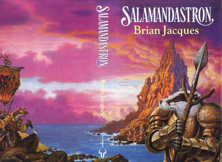
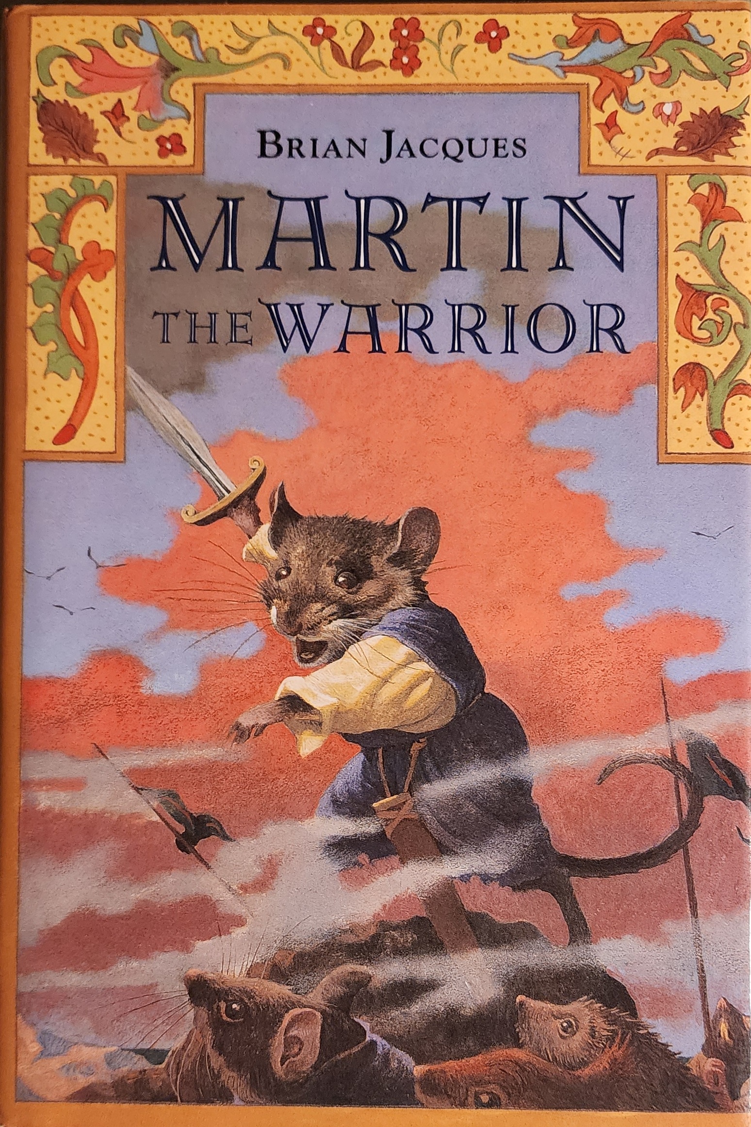
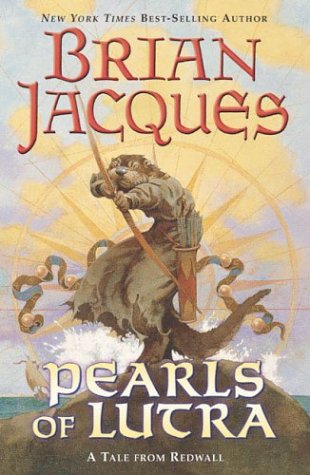
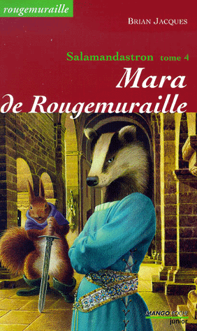
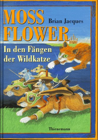
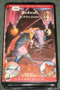
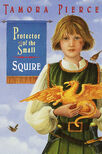
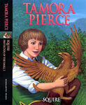
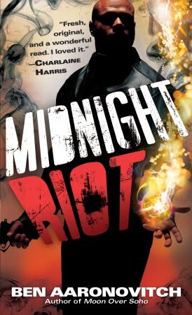
Music
- The original cover art for Japanese Doom Metal band Boris' album Smile is cute. The American release's cover is edgy.
- An inversion occurred when Within Temptation's album The Unforgiving made it to Japan...and the gothed-up Sharon Den Adel cover was replaced by one with a busty, Moe Meganekko schoolgirl waggling her finger at the buyer.
Video Games
Action-Adventure Games
- Compare the Japanese and American box art for the obscure Game Boy port of Milon's Secret Castle.
- The box art for Uncharted 2: Among Thieves is operating on this.
- In case no one seen it, the Japanese version resembles an Indiana Jones movie poster.
- Totally Rad is one of the most extreme examples. The translators changed most of the dialog and even its name from the original (which was called Magic John). And of course plunked in two completely different main characters in place of the originals. The result is a send-up of '80s surfer-dude culture in place of a fairly forgettable platformer.
- Not surprisingly, Magic John/Totally Rad was published by Jaleco, a company famous for having its game's characters and plot being almost completely altered for American release. A good example being Sayuuki World 2, a game based loosely on The Journey to the West which became the Native-American themed Whomp 'Em. The original Sayuuki World was never released outside Japan.
- Taro's Quest, an unreleased and unfinished localization of Jaleco's Dragon Quest clone Jajamaru Ninpou Chou, had major changes to the graphics, redrawing the character portraits to be less Super-Deformed and outright replacing some of the more goofy-looking monsters.
- The first Super Famicom Ganbare Goemon game was translated and brought over as Legend of the Mystical Ninja, and funky character renaming aside (Kid Ying and Dr. Yang? REALLY?), the box art was suitably "Americanised".
- E.V.O. Search for Eden is a Subversion; compare the SNES version's realistic, if fanciful, box art to the considerably cutesier Super Famicom version. Looks like a straight example, right? It turns out that the SNES version is actually using the original cover art from 4.6 Billion Year Story: The Theory of Evolution,[1] made by the same company for the PC-9801, and of which E.V.O. is a (loose) port!
- Just when you thought Nintendo was eschewing this with Kirby, along comes The Legend of Zelda: Spirit Tracks. In Japan and Europe, the box to Link's latest DS adventure features him happy riding his train (the train being the game's big innovation, after all) while in America, he's doing his best to look like a sword-brandishing tough guy. Which kind of clashes with the art style.
- Ironically, this also meant that America pretty much erased Zelda's first appearance on the box art of one of her own games, since the PAL and Japanese boxart features her in her ghost form and therefore suspiciously pale sitting on the top of the train. No, the pink Phantom on the American boxart does not count.
- The Legend of Zelda Phantom Hourglass did the same thing - Japan and Europe got a colourful spread of Link and Linebeck sailing about, the US art had them in moodier poses with a brown-shaded Phantom Ship as the backdrop.
- All of this is likely due to the Fan Dumb complaining about The Legend of Zelda the Wind Waker's cartoony and "kiddy" art style. Both Phantom Hourglass and Spirit Tracks retain said art style. A coincidence? Probably not.
- Ico's original cover did a good job of capturing the overall feel of the game - quiet, isolated, beautiful, and above all artistic. The American cover takes all of that away and gives it the look of an uninspired throwaway game, while making Ico himself look gritty, aggressive and as being straight from the Uncanny Valley - something he most definitely is not. The change was infamous enough that it actually gained a short set of comments from head development staff in an interview on its PS3 re-release.
- Sammy's Arkista's Ring for the NES features a badass elf chick in a Chainmail Bikini on the box. Somewhat of a subversion, as it was never released in Japan.
- The American box art of No More Heroes has Travis Touchdown holding his beam katana with an aggressive look. The European and Japanese box art has Travis standing in the streets of Santa Destroy with a smile on his face and an arm around Sylvia's waist.
- Considering the American version of the game also had the blood the game was originally intended to have, while others didn't, this might be reversed.
- Inverted with No More Heroes 2. All covers are intense, though the Japanese cover (especially the Hopper edition cover) is even more hardcore compared to the US/EU/AU one.
- One Piece Unlimited Cruise 1: The Treasure Beneath The Waves got a reworking for the European release. Here is the original Japanese boxart. For comparison, here is the European boxart. Averted for Unlimited Cruise 2: Awakening of a Hero, where the original Japanese boxart was used for both versions.
- The first Spyro the Dragon game has the reversed version of this (being cutened up), mainly with a Dreamworks Face. Just take a look at the American/European versions, then take a look at the Japanese version (where he seems to have lost his claws).
- The second game had that too. Compare the covers for the US version, European version and the Japanese version.
- In the Japanese version of the game the titular character is voiced by a woman with a much higher pitched, child-like voice compared to the Totally Radical teenage one he had in the American version, complete with cutesy little noises nearly every time he jumps.
- Asterix and Obelix XXL is a bit "American Kirby" compared to the source material, with the titular characters more aggressive than usual (with a good reason though, since the premise is the burning of their village and the capture of all their friends); however, while the European cover shows their faces drawn similarly to the comic book, the American cover is a render of their in-game selves, ready to fight. And, as you can notice, the game is called Asterix and Obelix Kick Buttix in the US!
- Jak and Daxter got the reverse of this: Compare the original American cover with the Japanese port.[2] Curiously, the American cover fits with the tone of the rest of the series, but not with the happy original.
- The Japanese cover art for Dynasty Warriors 7 was very minimalist, with simply the game's logo on a gold background. One can't blame Koei for wanting to spruce it up a bit. But they may have gone a bit too far.
- Solatorobo: While all covers are taken from official game art, the Japanese cover is definetly more happy-looking than the European and American ones.
- Inverted in the PlayStation 2 game called Dogs Life. The PAL and American covers are rather fitting for the game; showcases the villains, protagonist, and the dogs you can control all in the style used for cutscenes. The Japanese cover is just Jake running through a farm that vaguely resembles the Clarksville levels; and a stylistic version of him anyway.
- In the first English trailer for Kid Icarus: Uprising, Pit's voice gets even deeper than the English Brawl voice variant, mainly because his voice has changed.
- Now that the box art is revealed, this trope is in play again. While both the Japanese [dead link] and North American box [dead link] art show Pit with a furrowed brow, the NA version removed all traces of pink and gave him an angry frown instead of the open mouth smile.
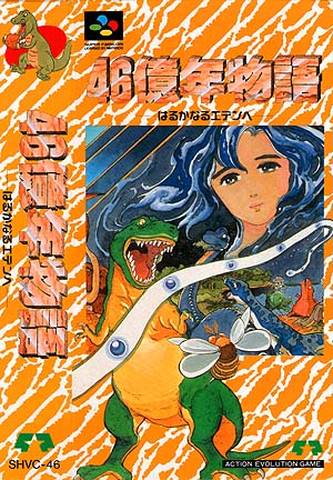
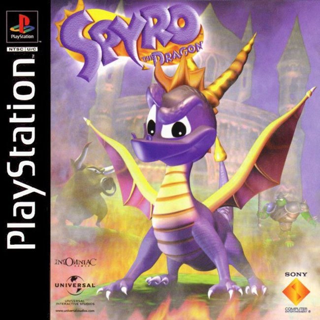
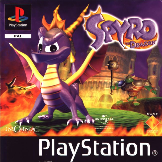
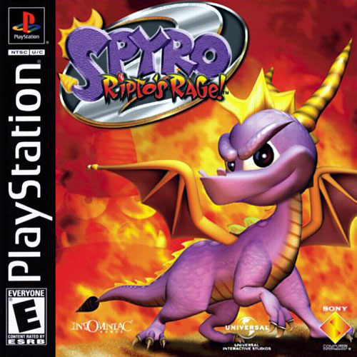
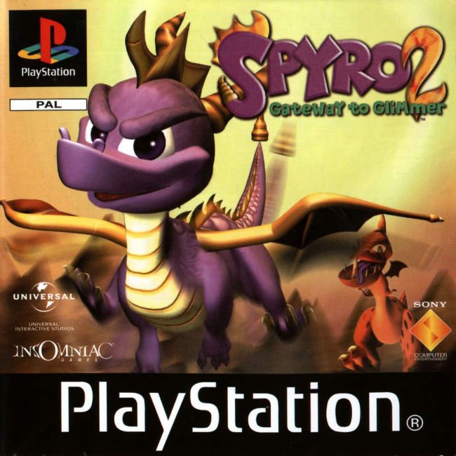
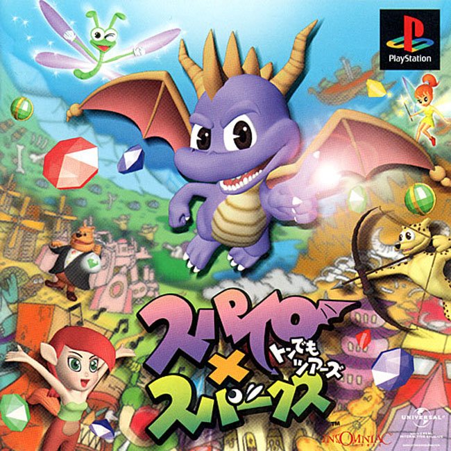
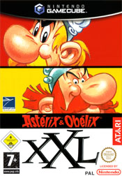
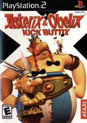
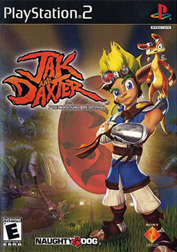
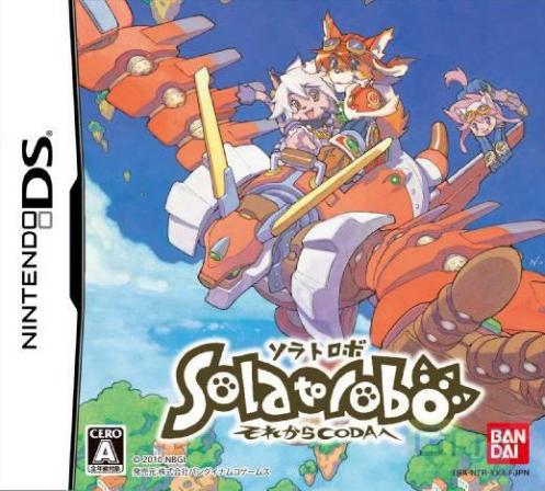
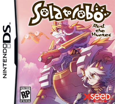
Action Games
- There is a variant cover for Gunstar Heroes is pretty much the same as the original release (right down to the poses), only all the characters are more realistically drawn, rather than the same style as the game itself.
- Game Freak's action puzzle game Quinty was released in America as Mendel Palace and... well, just look.
- While not quite a 'box art' example of the trope, the Tokyo Pop translation of Devil May Cry 3's manga changed 'tomato juice' to 'beer'. As in, what Dante drinks most of the time.
- The cover artwork of Demon Sword (the U.S. version of Fudō Myō-ō Den, a Famicom spinoff to Legend of Kage) depicts the protagonist as a long-haired Barbarian Hero instead of the Japanese swordsman actually featured in the game.
- Bomberman for the TurboGrafx-16—compare this [dead link] to this [dead link].
- Mass Destruction is a game where you drive a tank and blow things up. The Japanese cover depicts a tree in a park (Eh?). Compare the original American cover with the Japanese release.
- Seek And Destroy's American cover is far more hard core than the cover of any Japanese game from the entire series. Compare these two. There's no US army in that game...
Adventure Games
- Heavy Rain's European and American box art. The European version simply shows the origami bird figure, while the American box art shows the main cast standing behind the origami bird, with Madison Paige standing in the foreground (wearing a revealing tank top that she wore in only one part of the game) and Scott Shelby wielding a pistol. The Japanese box art [dead link] was simply an ominous sighting of a seemingly drowned man. The Japanese version isn't as mysterious as the European version, but it is significantly more solemn than the American version and more effectively conveys the seriousness of the game's subject matter than the American version does.
- In Japan, the cover of the first Gyakuten Saiban game is the same as the rest: Four portraits of the main characters in a row. In the US though, the first Ace Attorney game's cover is a picture of Phoenix pointing angrily, with Maya standing behind him and Edgeworth evilly overlooking them.
- And the European one is Phoenix standing in front of a white background, looking serious. Same trope, blander cover. At least later games retained the Japanese covers too.
Beat Em Ups
- River City Ransom is a textbook example. Contrast the Japanese box art, in which everyone looks more or less like they do in the actual game, with the American box art. Of course, even in the Japanese version, the heroes of that game, as well as every other game in the Kunio-Kun series, are indisputably hardcore. For the Japanese, "cute" and "hardcore" are not mutually exclusive.
- The American cover of Robo Army is, ahem, more "hardcore" than the Japanese original.
- Teenage Mutant Ninja Turtles IV: Turtles in Time. The Japanese version had art that looked just like the '80s cartoon (and by proxy, the actual damn game). The American version? As per Konami of America's standards at the time, incredibly hardcore and more like the original comic. (See also: Sunset Riders, most of the Contra games, and Castlevania III and IV.)
- The American cover art of Guardian Heroes replaced the original anime-style depictions of the six main characters with a fantasy novel-like illustration of Han fighting against the Undead Knight, even though he was one of the heroes in the game. The European version used the original Japanese art, but replaced the two heroines, Serena and Nicole, with Zur the magician and Macho the bodybuilder, who aren't even main characters, turning the European cover into a complete sausage fest for no reason (see for yourself).
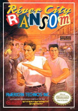
Fighting Games
- Compared to whatever North Americans got [dead link], the boxart of the European BlazBlue seems to suggest a Noel Third-Person Shooter spinoff rather than a Fighting Game, among things. The fact that the iconic title is merely featured as a background element with more emphasis put on a title written in a generic font doesn't help.
- 2D fighting classic Guilty Gear had 2 different covers for all their installments which got ported over the Pacific, most notably the Isuka installment: The Japanese version was rather KINKY (as in NSFW) with what apparently is a threesome(!) where a visibly flushed A.B.A. is seemingly getting double-penetrated in a sandwich between Ky Kiske (behind) and Sol Badguy (front), who are meanwhile completely ignoring her as they are engaged in a staring contest with each other (homoerotically charged full of Foe Yay). The American version on the other hand, was a rather generic image of Sol wielding his Fireseal sword in the style of a bazooka with the hilt pointed at you.
- Pit's (from Kid Icarus) English voice in Super Smash Bros Brawl sounds noticeably older than his original Japanese voice. Video comparison.
- As for the actual cover art for the game, Kirby's facial expression was left alone in the U.S. version (contrary to the name of the trope) -- the bright, partly cloudy blue skies were removed, on the other hand.
First-Person Shooter
- The American box art for Tom Clancy's Ghost Recon has soldiers in camouflage pointing guns and jumping out of helicopters (you know stuff you will be doing in the game). The Japanese box art has a painting of them relaxing in front of a pink sunset while they wait for extraction.
- In Elebits, the box art for the US audience is much more actiony that the other ones. Not only does the front of the boxart get a complete remake such that disorder can be shown, the back is also changed slightly: the back of the english European box art has three screenshots labeled "Seek!", "Find!" and "Catch!". The same three images on the back of the US box art are labeled "Hide!", "Seek!" and "Destroy!"
Multiple
- The Gallery of Hideous Box Art has a couple of examples for us to laugh at:
- Inverted with Astyanax
- On that note, one of Nintendo Power's in-house artists did a much better job on making an accurate illustration based on the game while still producing a quality piece. See for yourself.
- Clash at Demonhead
- El Viento
- Sky Kid (Note that the family-friendly furries became humans that blow stuff up.)
- Trouble Shooter
- Valis III... twice.
- Wurm
- Inverted with Astyanax
Pinball Games
- Classic Revenge Of The Gator for the Game Boy. In Japan, the 'gators in the cover are happy and smiling, and look a bit cartoony. The ones in the Western releases are gruffy, serious and drawn more realistically. Concidentally, it's made by HAL Laboratory, like Kirby.
Platformers
- The Trope Namer here is Kirby. The box art for many of his games have had angry eyebrows added to the main character to make an 8-inch-high pink puffball seem more aggressive. This strange practice is joked on originally in this YTMND and subsequently in this Brawl in the Family strip. It seems to have calmed for the time being with the release of Super Smash Bros.. Brawl, Kirby Super Star Ultra, and more recently,[when?] Kirby's Epic Yarn, whose boxarts have Kirby actually looking happy for a change, but it seems to be creeping up again no thanks to Kirby Mass Attack's cover (though to be fair, roughly half the Kirbys on Mass Attack's cover still retain their cute/curious expressions and most the the "hardcore" one are already attacking something). It's back in full force with Kirby's Return to Dream Land.
- This practice is Older Than They Think, too, as a Kirby's Dream Land 2 commercial aired in the US turned Kirby, Rick, Kine, and Coo into scowling tough guys (or, you know, as tough as an 8-inch high puffball and his similarly-sized friends can be) roughhousing some Hell's Angels. As well, compare the commercials for Kirby's Dreamland and Kirby's Adventure, to say nothing of the magazine ad for Kirby's Avalanche and Kirby's Dream Course (scroll down the page). "He used to be such a good boy."
- Even older than that, albeit to a lesser extent. Contrast the American box art [dead link] for the original Kirby's Dream Land to the Japanese box art [dead link]. Yes, Kirby's still plenty happy in America...but he's white, because it was thought that a soft, pink character wouldn't appeal to American audiences.
- It also showed up in Kirby Super Star; not so much the box art as the in-game dialogue, and not so much Kirby as Meta Knight. In Revenge of Meta Knight, what used to be an Anti-Hero with uncertain motives, as usual, was given several rewritten lines of dialogue to make him sound less like he was trying to do a good thing for Dream Land and more like he was trying to be the next Hitler. He even got "Prepare to Die!" as a line, replacing the fairly innocent "Now we duel!", explicitly ignoring Nintendo's policy at the time. The best part is that the changes were kept (besides "Prepare to die!", which became "Come meet your doom!") when the script was rewritten for Super Star Ultra.
- Kirby's Avalanche shows Kirby as a Jerkass who acts mean to his friends and acts sarcastic, saying things like "Oh, I'm so scared" and the like. Needless to say, the game was an installment of the ineffable cute Puyo Puyo series rebranded for an American audience.
- Ironically though, the cover for the game is in fact an inversion, with a cheerful Kirby (and even King Dedede) dancing around with Puyos in a colorful grassland.
- On the (unofficial) extreme end of the scale, there is There Will Be Brawl's version of Kirby...
- Nintendo Power lampshaded this phenomenon in the May 2011 issue's highlight on Kirby, saying he puts on his "angry eyes" for the boxart.
- As did IGN, when they launched a new feature comparing different box arts Kirby went first specifically thanks to the series' use of the trope.
- Even the title of 2011's DS game seems to carry on in this tradition; known as Gather! Kirby in Japan, its English title is Kirby Mass Attack. And to top it off, on the American boxart, nearly half of the Kirbies have angry faces... but the other half doesn't. This makes it... jarring, to say the least.
- ...and then Kirby's Return to Dream Land swings the pendulum right back around and gives him angry eyes again. Contrast the Japanese boxart.
- This practice is Older Than They Think, too, as a Kirby's Dream Land 2 commercial aired in the US turned Kirby, Rick, Kine, and Coo into scowling tough guys (or, you know, as tough as an 8-inch high puffball and his similarly-sized friends can be) roughhousing some Hell's Angels. As well, compare the commercials for Kirby's Dreamland and Kirby's Adventure, to say nothing of the magazine ad for Kirby's Avalanche and Kirby's Dream Course (scroll down the page). "He used to be such a good boy."
- Ristar originally only had angry eyebrows for boss fights; in the American version, they're present all the time. The enemies, too, look mean instead of neutral in the American release.
- Which is particularly weird, since one of the game's strongest points was its attention to little circumstantial details. All over the place there would be tiny little additions that aided characterization and plot in the dialogue-less game, from Ristar's playing in the snow in the snow levels, to the swarms of little musical nuances on Planet Sonata. So you'd really think the localizers would have wanted every last little touch they could get at.
- Though in what is probably an error, Ristar reverts to his Japanese smile when he's holding an object.
- Additionally, Ristar's European/American release contains a downright heart-warming inversion. While the Japanese version closed with a fairly cool scene of the villain, Greedy, and his henchmen picking themselves up on some barren world after their defeat, the English versions close with 'DAD!' and an image of Ristar throwing himself into the arms of his rescued father.
- Which is particularly weird, since one of the game's strongest points was its attention to little circumstantial details. All over the place there would be tiny little additions that aided characterization and plot in the dialogue-less game, from Ristar's playing in the snow in the snow levels, to the swarms of little musical nuances on Planet Sonata. So you'd really think the localizers would have wanted every last little touch they could get at.
- Blinx. Japanese Blinx looks like a sweet little anthro kitty cat; American Blinx looks downright mean.
- To the point where he looks like he's about to rip you limb from limb when he's trying to look helpful and friendly.
- Inverted with the Super Mario Bros. 2 box art. In Japan, everybody but Toad is scowling, engaged in some act of violence, or both. America gets a picture of Mario clutching a vegetable, with a big ol' smile on his face. The Japanese version was titled Super Mario USA, so the use of this trope may have been a deliberate attempt to invoke an American feel.
- At the same time, Super Mario USA's boxart is very similar to Doki Doki Panic's boxart, which was the game it mimicked.
- Namco briefly considered giving Klonoa a rather drastic makeover for the U.S. release of the Wii remake of his first game. While not exactly "hard", the new look was significantly less cute, looking like a generic anthropomorphic cat. Most bizarrely, however, they gave him "normal" anthro cat ears, despite Klonoa's droopy, almost hand-like ears having an actual gameplay role. And they took away his Pac-Man cap. Bad Namco! Fortunately, the game was released with Klonoa's original look intact- surprisingly enough, because the U.S. fanbase demanded he remain cute. Who says Japanese Klonoa Isn't Hardcore?
- That's because he didn't look hardcore enough on the US Lunatea's Veil box art (compare this), even with the angry eyebrows.
- For an example of becoming cuter in Japan, look no further than Ratchet and Clank. Here's a side by side comparison from Ratchet and Clank Future A Crack In Time. (Japan left, everywhere else on the right.)
- He isn't known as 'Groucho' Ratchet for nothing.
- The Big Ol' Eyebrows in his Japanese incarnation supposedly came about because initial market research showed the Japanese kids loved 'em.
- The first game had American cover intact when localized for Japan. From Ratchet and Clank Going Commando on, however, the American cover has remained stereotypically tough, while the Japanese version has gotten absurdly happy.
- He isn't known as 'Groucho' Ratchet for nothing.
- Crash Bandicoot is another American game where the main character was "cutened" up for the Japanese release. He even got a funky dance created by the Japanese that was carried back into the American versions. Some have speculated that this design change combined with Radical Entertainment's radical character redesigns that would make such things look awkward is what's making Radical's Crash games a no-go for the Japanese.
- Mega Man:
- An important thing to note is that the boxart for the first Mega Man was commissioned on very short notice, and the only direction the artist had was a brief description of the game's premise over the phone, which led to the image that looks like it belongs on a 80s sci-fi novel cover. For comparison purposes, here is the cover of the Japanese release. The European edition does a bit better, though it's still a drastic departure from the actual game. The second game's box, while still bad, at least has Mega Man correctly colored, and a few recognizable characters, more or less on par with the European version.
- European Mega Man 3 is an odd one: the robots are illustrated accurately, but Wily is beyond hardcore.
- The US producers of Mega Man 9 and 10 in keeping with their Retraux graphics style, had throwback boxart made to please the fans.
- Mega Man 7's ending, where Mega Man contemplates ending Dr. Wily's schemes once and for all. When Dr. Wily points out robot law prevents him from taking a human life, Mega Man simply stands there while Wily escapes. Unless we're in America, in which case he blurts the infamous "I am more than just a robot! Die Wily!!!" line...and hesitates anyway.
- On a similar note, the promotional artwork for the cartoon depicts Mega Man as ready to tear someone's spine out (or at least punch their lights out), and made him far more ripped than he was in the series proper.
- In Mega Man ZX Advent, this cover is actually poked fun at in the American version. In the game, for a mission you are supposed to get a data disk, an in game item that can be looked at to see a picture and some information, for a kid who wants something with a hero on it. In the end of "talk to the people who SHOULD have one" you find out that the kid has the only data disk with anything close, the data disk with the American boxart of the original Mega Man. The kid openly calls it weird, and not very heroic at all. You then get it to view at any time.
- Terrible Boxart Mega Man is so (in)famous that this is the version Capcom chooses to cameo in Street Fighter Versus Tekken.
- An old NES game, Power Blade (originally Power Blazer in Japan) is an interesting early example. Read the article about it here.
- Alisia Dragoon, a fairly obscure Genesis game by Game Arts, features a pretty cover in Japan, while the Western boxart is... well, cool-looking but rather contemptible.
- The original boxart for Sonic the Hedgehog gave us a fairly confident looking Sonic with a tasty palette of colors surrounding him. The US boxart gave him a chubbier redesign with a mohawk, the art has him posing for a 'tude expression, and they sprayed him with a coat of airbrush. Even the original members of Sonic Team said they despised this Americanized Sonic design.
- Dr. Eggman/Robotnik's classic design looked like a happy spherical fellow in the Japanese games. The American games made him a constantly scowling spherical fellow with... no eyes. This isn't even taking into account the weird cartoon-based design they switched to for some of the later boxart.
- The EU covers went in and out with both the Japanese and American styles. Interestingly cases such as Sonic the Hedgehog Sonic Chaos actually used Japanese promo artwork not related the region's original cover.
- The differences are probably best illustrated through the Sonic Shorts 5 segment in which Dr. Robotnik from the American Saturday morning Sonic cartoon discovers Dr. Eggman from the Japanese Sonic X.
- The Sonic CD boss music and game over music go from being mildly demented in the Japanese version to downright frightening in the American version.
- Dynamite Headdy. The biggest changes are that Trouble Bruin is brown instead of purple, and a giant doll becomes a mech. The boss in Headdy Wonderland was completely redesigned for Western audiences. Originally it was a Geisha that upon defeat becomes demonic with sharp-as-hell claws. The Western release got a robot and the claws were not as sharp.
- Tempo was a game about an adorable cartoon cricket that makes music. The US box art tried to make the main character look like a photo-realistic mutant cricket man in the vein of the Teenage Mutant Ninja Turtles, rippling with muscles and using kung-fu.
- Rocket Knight Adventures, released by Konami for the Sega Genesis/ Mega Drive. Similar to the Kirby examples, the American boxart gives Sparkster a look of grim determination, in contrast to the smiling Funny Animal knight the other regions got. It's interesting that the front artwork is almost identical on all other aspects, and that the EU version used the Japanese and not the American art.
- Not quite, the facial edit aside, the US cover actually adds an authentic touch with a detailed background replicating the in game ruins (in place of the Japanese cover's blue sky background). Interestingly the EU artwork uses the US's cover dynamic, suggesting they actually re-edited it to use the cuter more cheerful Sparkster again.
- This change is in fact a rare example that became the definitive characterization, as even the Japanese promotional artwork (and even the in game sprite art) for the sequel Sparkster depicts the title character with a serious scowl (even if his original wackier demeanor blatantly reappears from time to time in game).
- The American version of Castlevania: Bloodlines redrew Eric Lecarde's face to look manlier and less pretty boy-like (see for yourself). The European version, Castlevania: The New Generation, reverted Eric back to his original design, reusing the artwork of the Japanese box.
- Strangely inverted in Castlevania Lament of Innocence's cover. The US cover shows Leon Belmont looking upward, probably in prayer, while the Japanese and European covers show him in an action pose (And note how the European cover's done in CG, while the other two retain Ayami Kojima's famed artwork)
- Comparing Panic Restaurant's box art Japan, Europe and United States pretty much defines this trope, too.
- The game itself was altered (in a comparatively minor way); the Japanese version of the game had a cute young brown-haired chef in the title role. For the international release, he was switched out for a different, older, white-haired character resembling Chef Boyardee.
- We all know Donkey Kong, right? Well, we bet you've never seen him like this.
- The Colecovision cover on the other hand was looking fairly decent.
- The NES version of A Boy and His Blob and its Gameboy sequel had a small overhaul with the Boy's design, title screen and box art in Japan to make it look cuter.
- Chameleon Twist was a charming, adorable game starring Davy, a chameleon transformed into a bubble-headed long-tongued chibi alien, and his friends. Its boxart is an interesting variation on this trope: (The American boxart shows Davy gobbling up foes with a cheery grin, while the PAL version shows him gobbling up foes with a look of death in his eyes. Chameleon Twist 2, of course, played this trope straight for America and Europe—while Japanese buyers got the same adorable bubble-headed aliens as before, the American and European versions swapped the colors of Davy and his friend Jack (I suppose the localizers thought green was a better "default color" for a lizard) and turned all four characters into grotesque anthropomorphized lizards with semi-realistic heads. Also compare the US and EU boxart to see yet another cheerful-wrathful dichotomy.
- The box art for Bionic Commando Rearmed 2 seems to be a deliberate aversion of this trope, as the image of Spencer (with goofy smile and Porn Stache looking like he's about to give the viewer a hug) on the game's front cover can only be described as jarringly happy-go-lucky. Especially funny (until you beat the game) when you compare it to the cover art to the 2009 game which Rearmed 2 is a direct prequel to, which featured a goth-ified Spencer smouldering with generic rage.
- This Cave Story mockup cover parodies this trend.
- The Japanese and European cover art of Captain Silver for the Master System shows rather cartoon-like renditions of the game's protagonist and a few of the villains fighting on a pirate ship. The American cover art shows a similar scene, only the protagonist is drawn more realistically and he's fighting the final boss (the titular Captain Silver) one-on-one.
- Not even Disney games were immune to this. The Genesis/Megadrive title Quackshot features a dynamic shot of a scowling Donald Duck baring his gun with a evil looking Pete plotting in the background. The Japanese cover features Donald and his nephews smiling at you with Pete throwing a comical tantrum behind them. Granted Donald being Donald the Western cover might be considered more in-character.
- In some of the Bonk games, Bonk's second powerup form was changed. In the japanese verison he showed his love of meat by turning into a doe-eyed version of himself who attacked with hearts. In the US version he was changed into a scowling form with a scar rather similar to the page image. Though his third form was hardcore in both versions.
- Data East USA gave the Irem game Kaiketsu Yanchamaru a Totally Radical makeover, turning it into Kid Niki: Radical Ninja. Kid Niki was given spiky hair in-game, and the NES version got a totally hardcore cover (by contrast, the Famicom cover is downright cartoonish).
- An example that seemingly has nothing to do with America: Namco's Legend of Valkyrie series is rarely seen outside of Japan, but one of the side games, Sandra's Great Adventure, was released in Europe under the name Whirlo. As part of the localization, the main character's in-game sprite was changed to give him angry eyes.
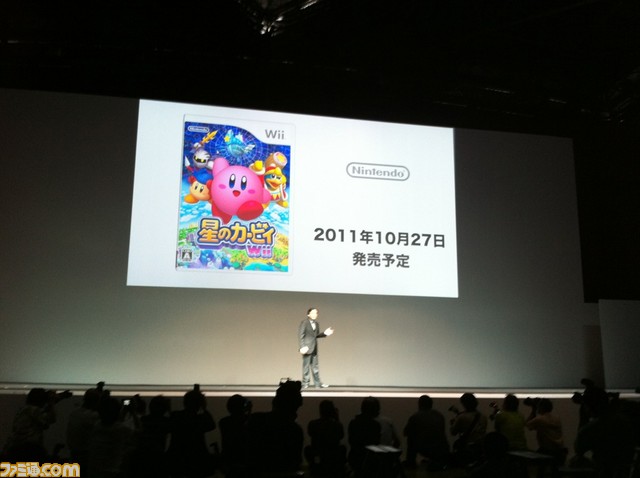
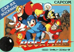
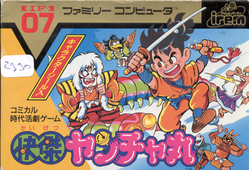
Puzzle Games
- Super Puzzle Bobble / Super Bust-A-Move's American boxarts, SBAM1 for the PlayStation 2 and BAM2 for the Sega Saturn replaces Bub and other characters with a screaming man with matchsticks keeping his eyes open and a baby from the pits of the Uncanny Valley blowing blood-red bubbles. What does that have to do anything with cutesy dragons solving puzzles?
- For no apparent reason, the Sega Saturn boxart of Bust-A-Move 2 decided to treat us to the oh-so-kid-friendly image of a disembodied head of a bald guy trapped in a bubble, with matchsticks shoved into his eyelids.
- Actually this happened with a good few titles in the series until recently, which omitted the cute little dinosaur mascots in favor of dynamically angled shots of detonating bubbles in a space age style background.
- Baku Baku Animal is a falling blocks puzzler game starring cutesy animals. Nothing could possibly makes it looks hardcore but that didn't stop whoever did the American cover from trying.
- This happened to the rather obscure NES puzzle game Palamedes. The game is basically Space Invaders Meets Yahtzee. The music is cheery, the graphics are cutesy; all player sprites are tiny, sugary little SD characters. There's absolutely nothing weird or bizzare or Gonk in this game. So where the hell did THIS come from?!
- Godzilla for the Game Boy came out in the U.S. with this cover, showing Godzilla like he looks in the movies and, with the intro screens, misleading people into expecting it to be a thrilling action game. Actually, the game, known as Gojira-kun in Japan, is a cutesy Puzzle Platformer, looking more like the Japanese cartridge.
- The Angry Video Game Nerd lampshaded this in his review of this and other Godzilla games.
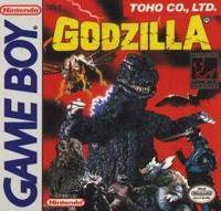
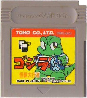
Roguelike
- The Nintendo DS version of Shiren the Wanderer. The original Japanese cover art (by former Capcom illustrator Akiman) is very nice, the Western one, well.... Shiren looks like he's going to slit your throat or something. And what they did to poor Koppa and Oryu is just wrong. Bad, bad Sega!
- Cult classic rpg/sim hybrid Azure Dreams for the PSX (which is basically Harvest Moon if the main character were a monster-tamer/treasure-hunter instead of a farmer/fisherman) had 2 different covers: The Japanese version was cute and emphasized the dating-sim/harem-romance aspects of the game (featuring all the girls - plus your kid sister and your sidekick - in the game you can eventually get via Tenchi Solution), while the American version was scenic and emphasized the treasure-hunting/dungeon-crawling aspects of the game (the hero gazing at his hometown from a mountain cliff).
- Still, we got the Japanese box art as the cover for the manual (at least in the European version anyway), so not all bad.
Real-Time Strategy
- Pikmin has two covers. The Japanese image contains Pikmin just hanging out on a branch. The North-American and European cover image contains a battle. The same thing happened with the sequel, though Canada and Europe had a different, also peaceful cover.
- The Settlers European cover shows a cartoonish RTS city builder while the American Cover shows a rather stern looking lord in managing his kingdom/army Comparisons here. Upon further inspection, the American cover of the settler usually just features the armor clad knight on the cover while the other shows the other professions being as prominent. The subsequent one features a slightly more colorful boxart seen here
- The PSP version of Lemmings exhibits this trope. The Japanese box art depicts a bunch of happy Lemmings in a happy, bright environment. The European box art shows a crowd of Lemmings smiling at you. The American box art depicts a more active scene, and has a slightly duller color scheme compared to the other boxes.
Role-Playing Games
- Breath of Fire:
- Breath of Fire I is a major example of this. Compare the Japanese box art with the American version, featuring Jim Lee-esque cover art in which Ryu became a Conan impersonator even though he is clearly depicted as a pretty-average built teenager in-game and Nina looked like a man.
- For Breath of Fire II: Japanese version - American version...
- Some adverts added in-your-face speech bubbles.
- On the Chrono Trigger packaging in Japan, there were images of all the playable characters in the game. In the US version, it had Frog, Crono, and Marle fighting Heckran, the scene captured while the party was using the Arc Impulse/Frost Arc Triple Tech. (The Nintendo DS Updated Rerelease gave a Shout-Out to this artwork by allowing players to replicate this in the form of having battles with Heckran-like enemies on a snowy mountain in a bonus dungeon.)
- This could be just artistic choice. The art is still Akira Toriyama's, the game's illustrator and character designer, just not the same scene used in the Japanese release.
- Or the artist was working from a beta screenshot.
- The box art of the early Dragon Warrior games for the NES was very different from the Japanese Dragon Quest box arts.
- May or may not be related. The US artwork was all by a Japanese artist as well, just not one who made such... cherubic characters. Which was a bit of a buzzkill to be honest, as Terada's artwork was clearly done after the final product was finished, having no influence anywhere in the game.
- Nintendo and Square Enix are at it again with Dragon Quest IX. In the Japanese box art, there's a group of four happy-go-lucky children in a market. The North American box art contains four older-looking warriors, three sporting Angry Eyebrows, ready for battle.
- The art shift also renders one character, though ostensibly wearing the same outfit, considerably more Stripperiffic.
- While it's not a comparison between American and Japanese, looking at the boxart on the Xbox360 version of Eternal Sonata then looking at the Play Station 3 version reveals that there were some drastic changes. The 360 version looks bright and innocent, with characters standing in a grassy meadow. The Play Station 3 version has a darker background, and has the characters looking angry in various action poses.
- Guardian's Crusade. The Japanese box art is more colorful and rather whimsical in looks: showing Knight and Baby doing various activities you can do in the game, all the while looking dang adorable. The back cover is even more cuter. The American version is more generic in comparison. The game came out about a year and a half after Final Fantasy VII, during that dark period when American game companies thought that RPGs that weren't dark and existential wouldn't sell.
- When Pokémon was being localized for America, a significant portion of people at Nintendo thought that the characters were too cute to sell well, and tried to get all of the Pokémon redone for the states as muscle-bound humanoid Pro-Wrestling monsters. In other words, they wanted to turn Pikachu into Kinnikuman.
- Compare the box-art of the Japanese version [dead link] of Pokémon Yellow to the American version [dead link]. Remarkably similar to the depiction of Kirby from Japan to America.
- The Last Remnant's Xbox 360 artwork depicted the young, typical Final Fantasy-style androgynous male protagonist. The PC version, marketed to Western gamers, had a picture of an older, more badass antagonist, and a more energetic color scheme.
- Digital Devil Saga: Avatar Tuner arguably benefited from this phenomenon. The original box art for the two games depicted Serph/Varna and Sera/Varnani in static poses more reminiscent of action figures in a blister pack; the U.S. versions depict the exact same characters, but in more active poses. (Assuming, of course, you reverse the cover insert for the second game; the display box art depicts the entire cast in a battle scene, arguably embracing this trope in its entirety.) Though it's not like the game needed to be made any more hardcore, seeing as how it has plenty of demonic cannibalization anyway.
- While we're on the subject of Shin Megami Tensei, just compare the original Japanese cover of Lighter and Softer spinoff Jack Bros. with this... thing.
- Hardly uncommon in Tales localizations:
- Tales of Eternia (or Tales of Destiny II) originally had a smiling group shot, which was replaced by a scene of Farah and Reid ready to battle. The absence of everyone else is... intriguing.
- Tales of the Abyss originally had a more peaceful, friendly group shot, while the American cover image has everybody except the girls fighting, and Luke ready to slice the player's head in half.
- Tales of Symphonia has, in the original version, another smiling group shot. In the US, another fight scene.
- Tales of Symphonia: Dawn of the New World, the same - Japanese cover, American cover. The European cover [dead link], however, goes for a simple group shot
- The game Resonance of Fate has peaceful box art with the three protagonists looking upon a tower in its original Japanese release End of Eternity. The US box art is shown to have them on various action poses with their guns to the viewer.
- In Fragile Dreams for the Wii, the English voices are closer to the age of the characters, around 14/15, while the Japanese voices make the characters sound younger. In addition, the box art, which was reversible in the American version, showed a vicious looking Seto holding a golf club on the American side, while the Japanese box art shows Seto and Ren holding hands over a watery background.
- Oh boy, NieR. It is quite possibly the ultimate logical conclusion of this trope, to where it not only deals with cover art but the actual game. To explain: NieR is the name of two parallel-developed Square Enix games, NieR Gestalt (Xbox 360) and NieR Replicant (Play Station 3). In Gestalt, the eponymous protagonist is a hulking, white-haired middle-aged man searching for a cure to the Black Scrawl virus, which is ailing his daughter, Yonah. In Replicant, the eponymous protagonist is a young White-Haired Pretty Boy who is searching for a cure to the Black Scrawl virus, which is ailing his little sister, Yonah. In case you haven't caught on yet, this is literally the only difference between the two versions. The American branch of Square Enix actually paid to develop an entirely separate version of the game where the only difference is the design of the protagonist. The official reason behind the two versions is that they believed the game would not sell well in the west if the protagonist was young and pretty, rather than grizzled and muscle-bound. While Replicant was the original idea, in Japan both versions of the game are available, and overseas only Gestalt was released (entitled simply NIER).
- On the flip side, this is why the young, pretty Vaan was added to Final Fantasy XII. The original protagonist was supposed to be Basch. This is why Vaan has nearly no character development.
- The Wild ARMs series usually either retains the original cover art or replaces it by something that, while different, keeps the tone. Exceptions can be found in the first title (J; U) and Wild ARMs 5 (J; U).
- The indie/doujin game Protect Me Knight does this on their web page. The Japanese page depicts a bunch of cute characters in a more Puni Plush/Bishonen style while the English page depicts something more muscular, epic, and violent.
- This may have been intentional Lampshade Hanging on the dev team's part though.
- Shadow Hearts: From the New World's Japanese cover is actually pretty happy, which actually matches the Lighter and Softer nature of the game, if compared to its predecessors (it's also the only of the game's covers that uses a hand-drawn illustration instead of CGI). The American cover chose instead to showcase a much more tragic/aggressive scene, complete with strong red background to emphasize edginess. The European cover is a middle ground - more hardcore than the Japanese cover, but quite less than the American one.
- Final Fantasy III had an intricate design in the Japanese and European versions while in the US release, everything was removed except for the logo.
- Interestingly, this is a reversal of the usual trend for new entries. Typically, the Japanese and European cover art for any one main instalment will consist almost entirely of the logo against a clean white background, while the American cover art will move the logo to a corner to focus on a rendering of one or more of the central cast.
- Final Fantasy IV character art in an old edition of Nintendo Power. Compare Amano's original Cecil design with the Nintendo Power artwork. Strangely enough, the Nintendo Power artwork was drawn by a Japanese artist.
- Take a guess which is the Japanese artwork and which is the American one
- Eternal Eyes is a powerful contender for the most misleading use of this trope ever. Japanese cover screams "a JRPG", and a JRPG it is. The US cover... what the...
- Thunder... Thunder... THUNDERCATS, HOOOOO!
- Anyone seen the Suikoden boxart? Yeesh, there are still debates over who is supposed to be depicted on that cover, because it's clearly not anyone present in the game. The only part of that cover that's in the game is the 3 headed skull monster in the bottom right corner! Here's the Japanese cover to compare. The icing on the cake? The image on the Japanese cover is used on the US version's instruction manual, so gamers got a nice moment of surprise before they even started up the game for the first time. Future installments in the series thankfully ditched this artwork in favor of the Japanese art.
- Narrowly averted with the European release of Agarest Senki. Take this comparison: right is the final result, left is What Could Have Been.
- Blue Dragon has this (well, kinda). The japanese box art (available on the manual) makes Shu & the titular dragon look kind of silly. The american box art [dead link], on the other hand, makes both look positively badass.
- EarthBound has a minor example: the Japanese boxart was just blank red with the logo, whereas the English boxart instead depicts a Final Starman towering imposingly over Ness on a psychadelic background. Also, the English release material made and used modified versions of Ness and Paula's clay-model artwork to make them look more realistically proportioned, less cutesy, and in Ness's case more Totally Radical (strangely, neither Jeff nor Poo were modified the same way).
- Monster Rancher plays this straight for almost every one of its games. Compare the artwork for original game, where the Japanese artwork just has several monsters posing while the American one has a fight going on. Compare the idealistic Japanese fourth game cover to the intense American version.
- The Phantasy Star series has always had awful, awful box art for the western releases, but they went all out for the fourth game. They hired renowned fantasy artist Boris effing Vallejo to re-do the cover for the European and American editions of the game, which turned Rune into a 40-something kung-fu movie villain, Rika into a brunette elf with an 80's secretary haircut, and Chaz into Hans from Die Hard.
- The American box art for MS Saga is the original box art, but zooms in on the Pietà Plagiarism to avoid showing the colorful landscape in the corners and then mutes the colors a bit.
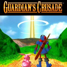
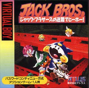
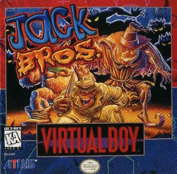
Shoot Em Ups
- Castle of Shikigami, a bullet-hell game for the PlayStation 2 in Japan, is a game about various people teaming up to defeat the villain and save the day by flying through the air and shooting things with various types of laser-like projectiles, and featured cute anime characters on the box art. In America, the game is called Mobile Light Force and the cover features three leather-clad, gun-toting, large-breasted Charlie's-Angels-esque babes running around and outright lying about the content of the game. Castle of Shikigami 2 did not suffer this treatment, however, it DID suffer from being completely un-localized despite being translated and voice-acted, with some scenes not being translated or voice-acted in English at all and left with Japanese text and/or dialogue. Despite this, they're not bad games.
Simulation Games
- There isn't much you can do to make peaceful series like Harvest Moon "hardcore" however many of the early western covers are more normal than the Tastes Like Diabetes Japanese ones. A noticeable exception is the European boxart for the first game: Compare the Japanese art, with its cute animals and bright colors to the darker and more realistic looking PAL cover. Notice how Pete isn't wearing the right hat and the game looks like this.
- The game Princess on Ice isn't so much "hardcore" as hideously ugly in the US version, even going so far as to replace the cute in-game sprites with "girls" that look like what you see on the box. Observe.
- Aksys learned their lesson afterward and released Rockin' Pretty, which uses the same characters, with the artwork untouched.
Stealth-Based Games
- Two sets of promo character renders were made for Metal Gear Solid 3DS - one for Japan, and one for America. The Japanese renders show Big Boss and The Boss standing unarmed, with Big Boss looking a little naive but also tough and sexy, and The Boss looking noble and idealistic but also muscular and strong. The American renders show them both scowling and in Ass Kicking Poses, brandishing knives. And they are both dressed in less revealing clothes, and The Boss has her Absolute Cleavage done up, because America considers Fan Service less innocuous than violence.
Survival Horror
- Bucking the trend, when Resident Evil 4 was released in Japan, Ashley's Jiggle Physics from the US version were removed. Here's a comparison.
- And the chainsaw decapitation was censored out.
- Compare the box art for the first Resident Evil game from the Japanese version to the American and PAL versions.
- Here's the Japanese boxart for Deadly Premonition, which shows you exactly what to expect. This is what was decided on for localization for some bizarre reason.
- Fatal Frame's original cover has the main character lying serenely on the floor. The American edition? Floating Head Syndrome. The European cover decided to go the middle route. And this is more or less repeated for the Xbox special edition except Europe followed the North American one (JP, NA, EU).
- Miku's actual in-game model in the first game was altered to look slightly older and less schoolgirl-y for the US release.
- In Dino Crisis, Regina's character model in CG artwork was modified. In the Japanese version, she had small lips and big anime-style eyes. In the western version, she was given smaller eyes and fuller lips.
- Both this and the Fatal Frame touch-up are to accommodate the very different concepts of sexiness that Americans and the Japanese generally hold (yup, cute can also be considered sexy in Japan).
Turn-Based Strategy
- The main Disgaea games experience this, abandoning the colorful Super-Deformed Team Shot the JP boxarts use (Which also includes most of the generic character classes, and sometimes even The Cameo and/or Big Bad), in favor of an image that makes the game seem darker and more serious then it really is (Most of the time, at least).
- Something akin to this trope occurred in Final Fantasy Tactics: The War of the Lions, where Barrington's dialogue with Rafa on the Rooftop of Riovanes Castle was "punched up" to make it even more creepy and blatantly sexual. The original PSX version's translation instead very slightly downplayed that aspect.
Web Original
- Most paintings by the infamous Handre de Jager from Something Awful mercilessly parody this trope. The artist himself stated that his initial inspiration was the aforementioned original American boxart for Mega Man. Handre's works can be found throughout the Internet. Be warned, they're disgusting and scary.
- While not an actual example of this trope, honorable mention must be given to There Will Be Brawl, for portraying Kirby as scary.
Western Animation
- Inverted for Transformers Animated's debut in Japan. In order to turn it into a prequel to the live-action movies (or so we thought), among other things, a new logo looking almost exactly like the film logos was comissioned, which practically clashes with the show's cartoony art style. And to think that Japan once played this straight with Transformers by gag dubbing the edgy Beast Wars... (Though there might be a reason as to the shift in attitude --- see the Transformers films' entries on Germans Love David Hasselhoff).
- Just to be clear, this is not the first time that Japan has made Americans very confused about the continuity choices the Japanese side makes.
- The French publicity posters for The Secret of Kells is much more action-oriented (having the two main characters surrounded by black, angry dogs while holding up a ball of light) than the subtle, reserved posters the rest of the world got (a small face gently smiling, most hidden by leaves).
- Oban Star Racers had a mixed french/japanese J-pop opening theme in France, Great Britain & Japan. The US got a generic rock song called "Never say Never" (No, not that one)
Other Media
- These box arts for Touhou merchandise are in the same parody league as Handre's art. ...we hope. NSFW link, by the way.
- Back in the '80s Japan got some special My Little Pony toys which were supposed to be even cuter than the normal ones, called Osharena Pony.
- The artists who design Polish Film Posters are famous for adding a bit of edginess, even if the original poster was already a bit edgy. Check out the poster for Alfred Hitchcock's Vertigo as as it appeared in Poland [dead link] compared to the original.
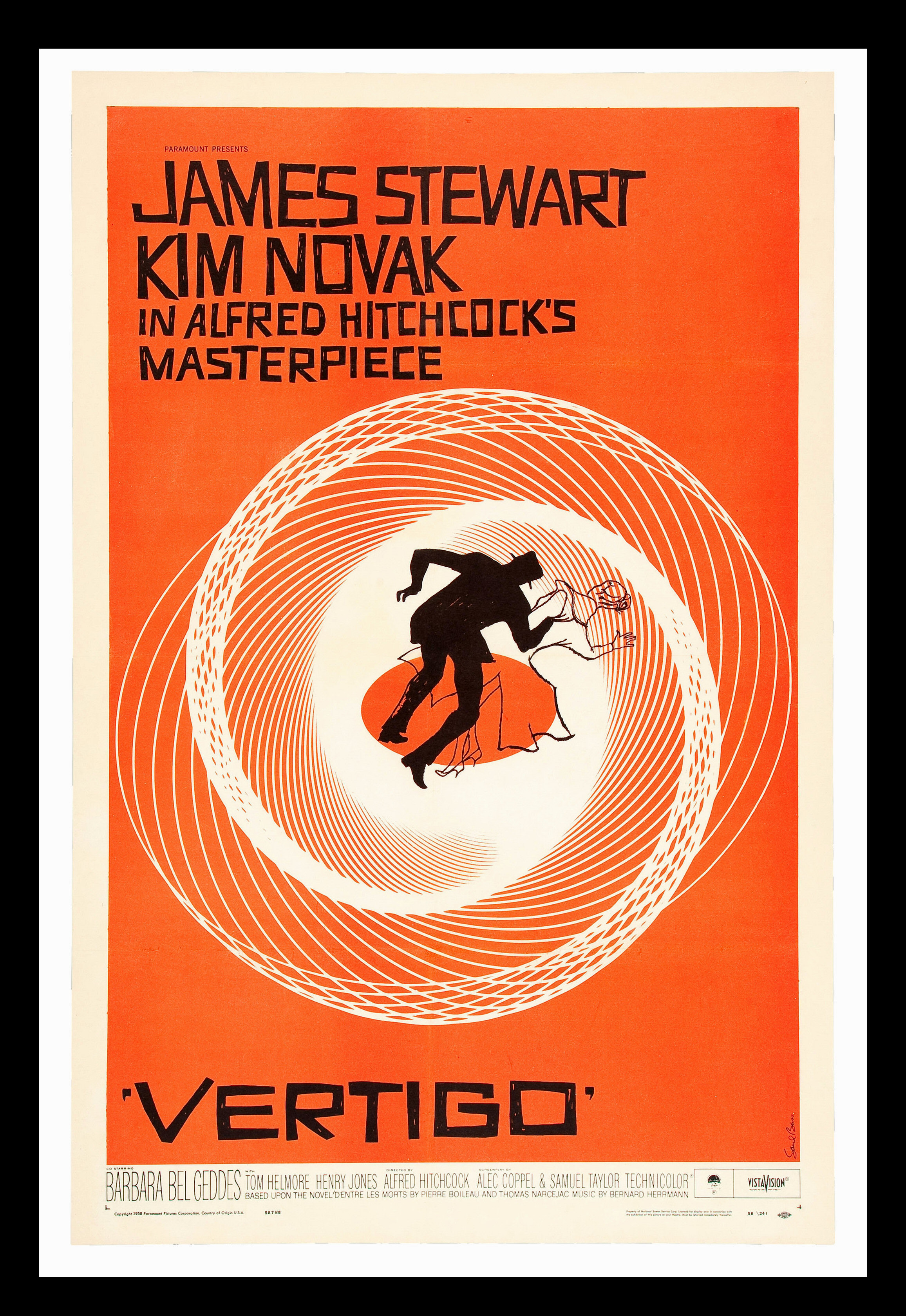
- ↑ Which is what the SFC version of E.V.O. is named in Japan. Image is the cover art for the Symphonic Synth Suite album.
- ↑ Image from Hardcore Gaming 101